Creating User Interfaces with Flutter

1 App Development

1.1 Blank App

    import 'package:flutter/material.dart';
    
    // Program execution starts here
    void main(){
        // run our app which is a MaterialApp
        // This allows us to use Material Design
        // MaterialApp is a very good choice for Android
        runApp(MaterialApp(
        // The home parameter specifies the screen we want to show
            home: Home(),
        ));
    }
    
    // This is the screen we want to develop
    // It inherits from StatelessWidget
    // In this example, we use StatelessWidget,
    // in future, we see Stateful Widget.
    class Home extends StatelessWidget{
        // BuildContext is an object that represents the location of a widget in the widget tree.
        // It allows a widget to access information about its parent, child, and surrounding context.
        @override
        Widget build(BuildContext context)
        {
            // This holds everything inside the widget
            return Scaffold(
            );
        }
    }

App Screen

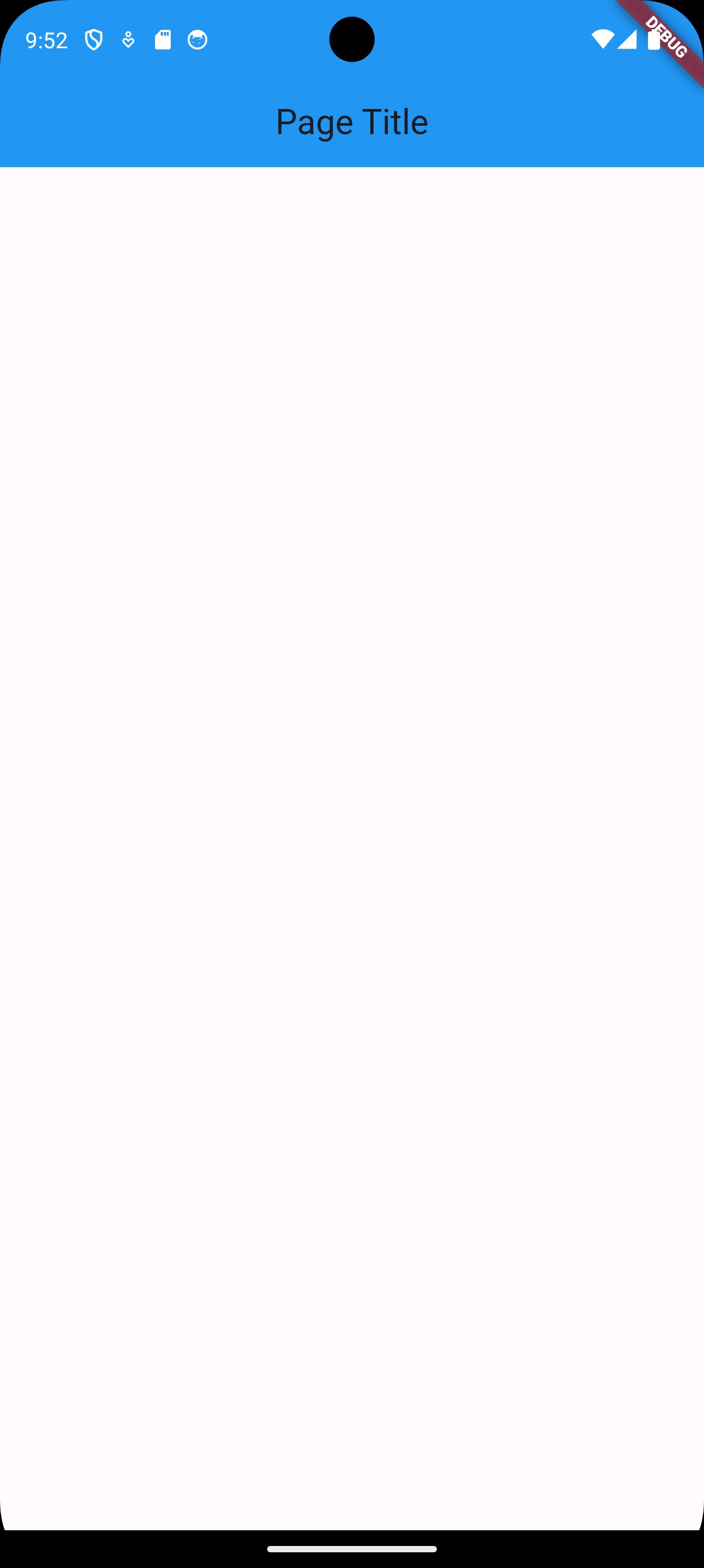
1.2 Adding an App Bar

    import 'package:flutter/material.dart'; 
    
    void main(){        
        runApp(MaterialApp(     
            home: Home(),
        ));
    }   
    
    class Home extends StatelessWidget{      
        @override
        Widget build(BuildContext context)
        {           
            return Scaffold(
            // Inside the Scaffold, we can continue building our widget tree,
            // we add an AppBar
            appBar: AppBar(
                title: const Text('Page Title'),
                centerTitle: true,
                backgroundColor: Colors.blue[500],
            ),
            );
        }
    }

App Screen

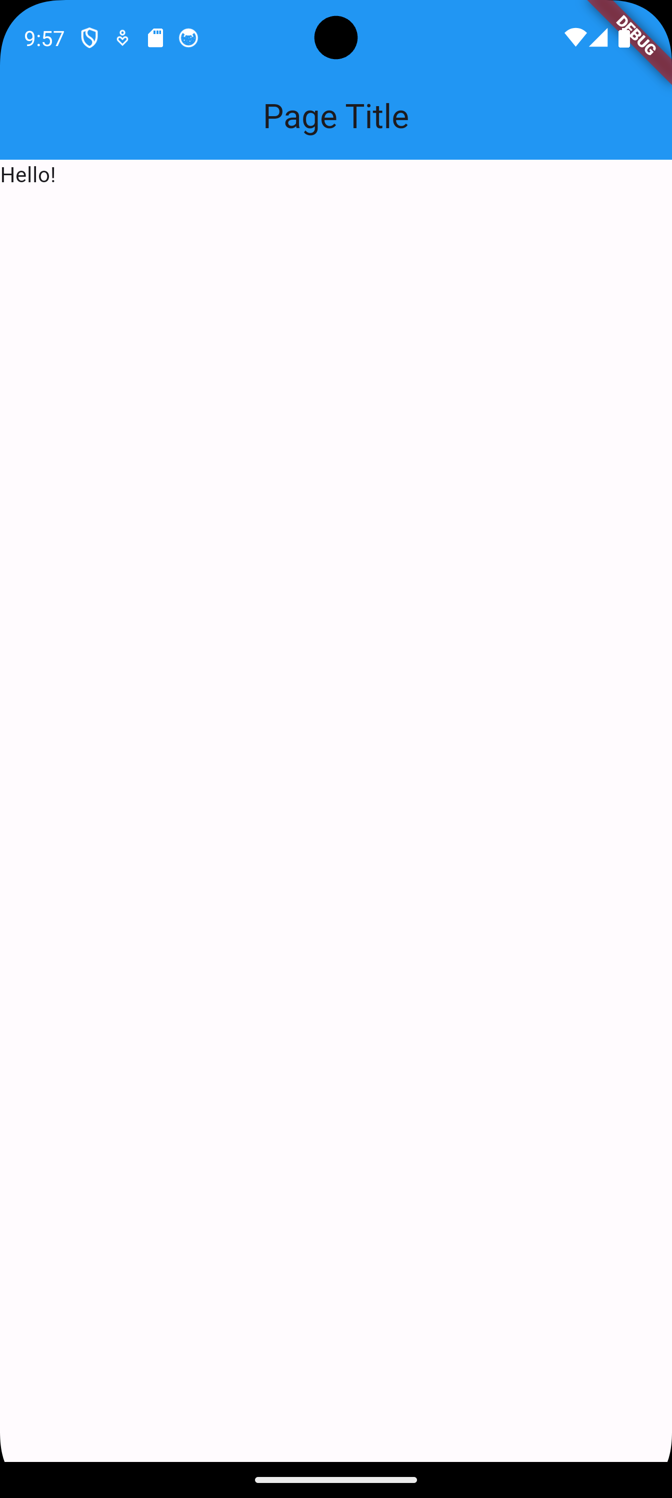
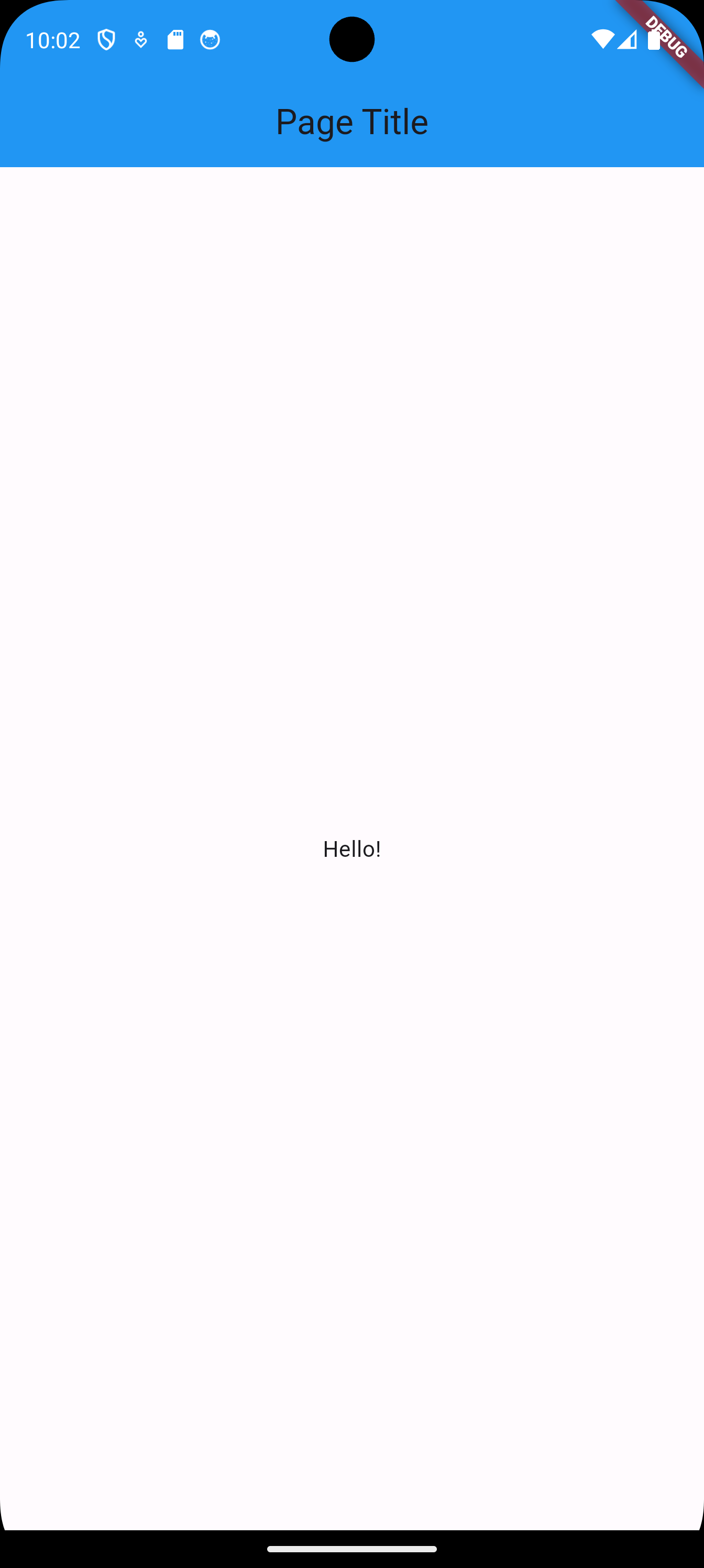
1.3 Adding a Text Widget to the Body of the Scaffold

    import 'package:flutter/material.dart'; 
    
    void main(){        
        runApp(MaterialApp(     
            home: Home(),
        ));
    }   
    
    class Home extends StatelessWidget{      
        @override
        Widget build(BuildContext context)
        {           
            return Scaffold(
            appBar: AppBar(
                title: const Text('Page Title'),
                centerTitle: true,
                backgroundColor: Colors.blue[500],
            ),
            // Add a Text widget to the body of the of Scaffold
            body: Text('Hello!'),
            );
        }
    }

App Screen

1.4 Centering the Added Text Widget

    import 'package:flutter/material.dart'; 
    
    void main(){        
        runApp(MaterialApp(     
            home: Home(),
        ));
    }   
    
    class Home extends StatelessWidget{      
        @override
        Widget build(BuildContext context)
        {           
            return Scaffold(
            appBar: AppBar(
            title: const Text('Page Title'),
            centerTitle: true,
            backgroundColor: Colors.blue[500],
            ),
            // Add a Center widget to the body
            // It will center everything inside it
            body: Center(
                // Nested widgets are added using the parameter child
                child: Text('Hello!'),
            ),
            );
        }
    }

App Screen

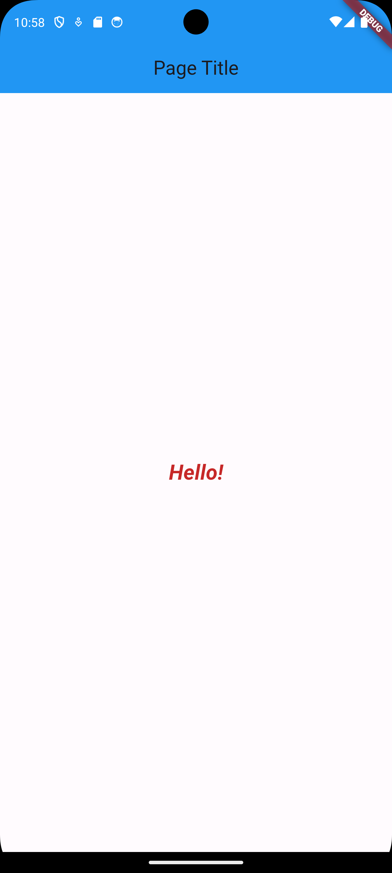
1.5 Changing the Text Styling

Go to https://api.flutter.dev/flutter/widgets/Text-class.html and explore the different options we have. The following is an extract of what can be used.

  • maxLines int?
    An optional maximum number of lines for the text to span, wrapping if necessary. If the text exceeds the given number of lines, it will be truncated according to overflow.

  • overflow TextOverflow?
    How visual overflow should be handled.

  • selectionColor Color?
    The color to use when painting the selection.

  • softWrap bool?
    Whether the text should break at soft line breaks.

  • strutStyle StrutStyle?
    The strut style to use. Strut style defines the strut, which sets minimum vertical layout metrics.

  • style TextStyle?
    If non-null, the style to use for this text.

  • textAlign TextAlign?
    How the text should be aligned horizontally.

  • textDirection TextDirection?
    The directionality of the text.

Let’s say I want to use the style attribute, the documentation says it should be of type TextStyle. So let us see what TextStyle has to offer.

  • background Paint?
    The paint drawn as a background for the text.

  • backgroundColor Color?
    The color to use as the background for the text.

  • color Color?
    The color to use when painting the text.

  • debugLabel String?
    A human-readable description of this text style.

  • decoration TextDecoration?
    The decorations to paint near the text (e.g., an underline).

  • decorationColor Color?
    The color in which to paint the text decorations.

  • decorationStyle TextDecorationStyle?
    The style in which to paint the text decorations (e.g., dashed).

  • decorationThickness double?
    The thickness of the decoration stroke as a multiplier of the thickness defined by the font.

  • fontFamily String?
    The name of the font to use when painting the text (e.g., Roboto).

  • fontFamilyFallback List<String>?
    The ordered list of font families to fall back on when a glyph cannot be found in a higher priority font family.

  • fontFeatures List<FontFeature>?
    A list of FontFeatures that affect how the font selects glyphs.

  • fontSize double?
    The size of fonts (in logical pixels) to use when painting the text.

  • fontStyle FontStyle?
    The typeface variant to use when drawing the letters (e.g., italics).

  • fontVariations List<FontVariation>?
    A list of FontVariations that affect how a variable font is rendered.

  • fontWeight FontWeight?
    The typeface thickness to use when painting the text (e.g., bold).

  • foreground Paint?
    The paint drawn as a foreground for the text.

  • hashCode int
    The hash code for this object.

  • height double?
    The height of this text span, as a multiple of the font size.

  • inherit bool
    Whether null values in this TextStyle can be replaced with their value in another TextStyle using merge.

  • leadingDistribution TextLeadingDistribution?
    How the vertical space added by the height multiplier should be distributed over and under the text.

  • letterSpacing double?
    The amount of space (in logical pixels) to add between each letter. A negative value can be used to bring the letters closer.

  • locale Locale?
    The locale used to select region-specific glyphs.

  • overflow TextOverflow?
    How visual text overflow should be handled.

  • runtimeType Type
    A representation of the runtime type of the object.

  • shadows List<Shadow>?
    A list of Shadows that will be painted underneath the text.

  • textBaseline TextBaseline?
    The common baseline that should be aligned between this text span and its parent text span, or, for the root text spans, with the line box.

  • wordSpacing double?
    The amount of space (in logical pixels) to add at each sequence of white-space (i.e., between each word). A negative value can be used to bring the words closer.

Here, we will change style to italic, bold, and we will change size as well.

    import 'package:flutter/material.dart'; 
    
    void main(){        
        runApp(MaterialApp(     
            home: Home(),
        ));
    }   
    
    class Home extends StatelessWidget{      
        @override
        Widget build(BuildContext context)
        {           
            return Scaffold(
                appBar: AppBar(
                    title: const Text('Page Title'),
                    centerTitle: true,
                    backgroundColor: Colors.blue[500],
                ),          
                body: Center(               
                    child: Text('Hello!',        
                        // we add a style parameter which is a TextStyle widget
                        style: TextStyle(
                            // choose a color for the TextStyle widget
                            color: Colors.red[800],
                            // a style
                            fontStyle: FontStyle.italic,
                            // a size
                            fontSize: 24,
                            // a boldness
                            fontWeight: FontWeight.bold,
                        ),
                    ),
                ),
            );
        }
    }

App Screen

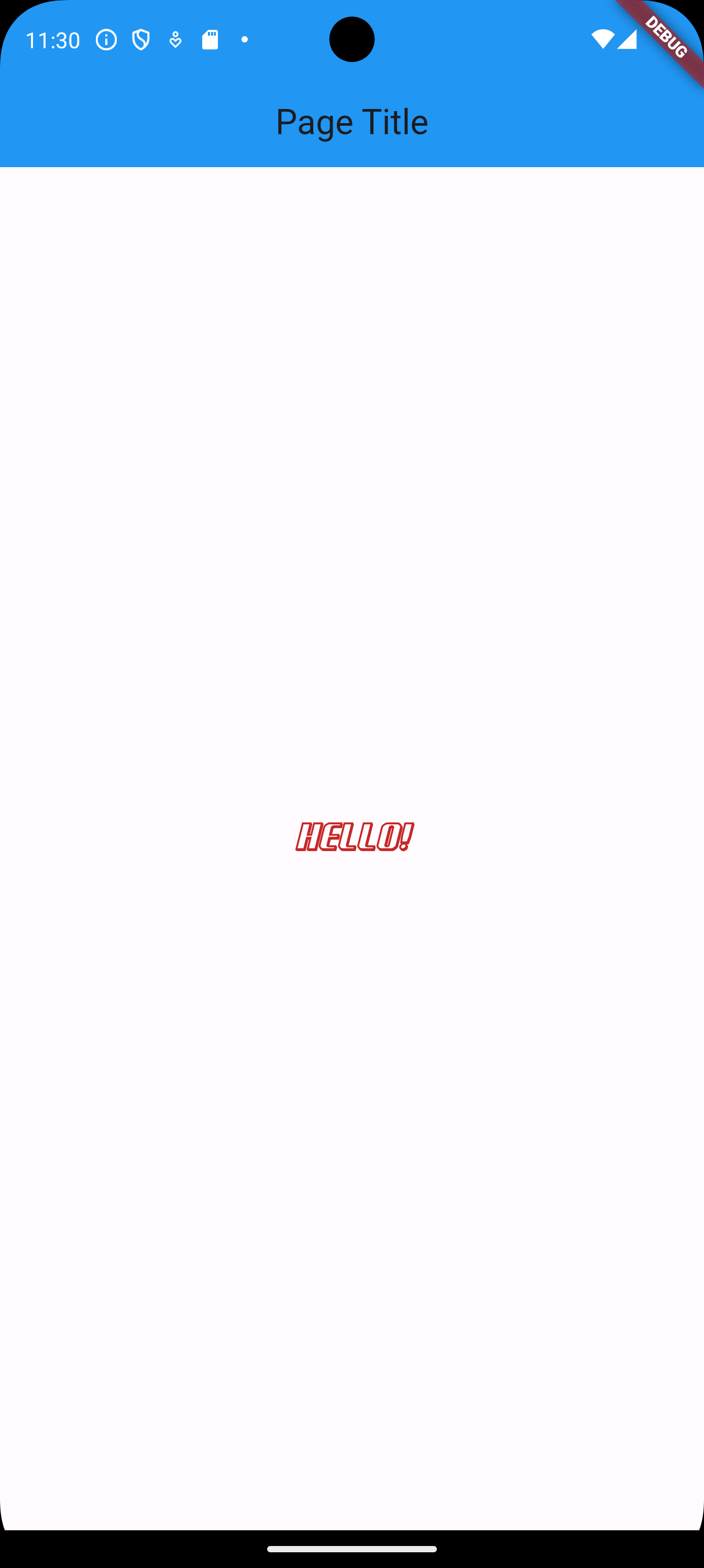
1.6 Changing the Font

If a font other than the default font is to be used, it must be supplied with the app.

  • We first need to obtain the font by downloading it (or creating it for the enthusiastic).

  • We need to create a folder in the IDE for the font, and then drag and drop the font file from the file manager to the created folder in the IDE.

  • Then, we need to modify the pubspec.yaml by adding the following information at the bottom. The file pubspec.yaml is very sensitive about spaces, so always indent by exactly two spaces.

            flutter:
              uses-material-design: true
              # This is where I am adding the font
              fonts:
              # The name I am choosing for this font is NormandyBeach
                - family: NormandyBeach
                fonts:
                  # This is the path to the font in the project
                  - asset: lib/assets/fonts/NormandyBeach3DItalic.otf

After that, we can use the new font as follows.

    import 'package:flutter/material.dart'; 
    
    void main(){        
        runApp(MaterialApp(     
            home: Home(),
        ));
    }   
    
    class Home extends StatelessWidget{      
        @override
        Widget build(BuildContext context)
        {           
            return Scaffold(
                appBar: AppBar(
                    title: const Text('Page Title'),
                    centerTitle: true,
                    backgroundColor: Colors.blue[500],
                ),          
                body: Center(               
                    child: Text('Hello!',                               
                        style: TextStyle(                           
                            color: Colors.red[800],
                            fontStyle: FontStyle.italic,
                            fontSize: 24,
                            fontWeight: FontWeight.bold,
                            // a font family
                            fontFamily: 'NormandyBeach',
                        ),
                    ),
                ),
            );
        }
    }

App Screen

1.7 Adding an Image

In order to add an image, we need to perform the following steps.

  • We first need to obtain the image.

  • We need to create a folder in the IDE for the image, and then drag and drop the image file from the file manager to the created folder in the IDE.

  • Then, we need to modify the pubspec.yaml by adding the following information at the bottom. Again, the file pubspec.yaml is very sensitive about spaces, so always indent by exactly two spaces.

            flutter:
              uses-material-design: true
              # This is where I am adding the font
              fonts:
                # The name I am choosing for this font is NormandyBeach
                - family: NormandyBeach
                fonts:
                  # This is the path to the font in the project
                  - asset: lib/assets/fonts/NormandyBeach3DItalic.otf
              # We add images here 
              assets:
                # We can either specify the folder to add all images to it
                # Or we can add only the image by specifying its filename
                # Notice that if the image is in lib/assets/images/subfolder,
                # it will not be added here
                - lib/assets/images/
    import 'package:flutter/material.dart'; 
    
    void main(){        
        runApp(MaterialApp(     
            home: Home(),
        ));
    }   
    
    class Home extends StatelessWidget{      
        @override
        Widget build(BuildContext context)
        {           
            return Scaffold(
                appBar: AppBar(
                    title: const Text('Page Title'),
                    centerTitle: true,
                    backgroundColor: Colors.blue[500],
                ),          
                body: Center(               
                    child: Image.asset('lib/assets/images/snow-1.png')
                ),
            );
        }
    }

App Screen

1.8 Stretching an Image

In the previous example, you can notice two spaces, one at the top of the image, and one at the bottom of the image; which looks unprofessional. In order to stretch the image to fill the whole space, we can use the following (there are other ways).

    import 'package:flutter/material.dart';
    
    void main() {
        runApp(MaterialApp(
            home: Home(),
        ));
    }
    
    class Home extends StatelessWidget {
        @override
        Widget build(BuildContext context) {
            return Scaffold(
                appBar: AppBar(
                    title: const Text('Page Title'),
                    centerTitle: true,
                    backgroundColor: Colors.blue[500],
                ),
                body: Center(
                    // use SizedBox
                    child: SizedBox.expand(
                        child: Image.asset(
                            'lib/assets/images/snow-1.png',
                            // stretch to fill
                            fit: BoxFit.fill,
                        )
                    ),
                ),
            );
        }
    }

We can also use:

    import 'package:flutter/material.dart';
    
    void main() {
        runApp(MaterialApp(
            home: Home(),
        ));
    }
    
    class Home extends StatelessWidget {
        @override
        Widget build(BuildContext context) {
            return Scaffold(
                appBar: AppBar(
                    title: const Text('Page Title'),
                    centerTitle: true,
                    backgroundColor: Colors.blue[500],
                ),
                body: Center(               
                    child: Image.asset(
                        'lib/assets/images/snow-1.png',
                        fit: BoxFit.fill,
                        // stretch by hand
                        height: double.infinity,
                        width: double.infinity,
                    ),              
                ),
            );
        }
    }   

App Screen

1.9 Text on Top of Image

If we want to position widgets on top of each other, we use the Stack widget. Let’s position the text we had on top of the image.

    import 'package:flutter/material.dart';
    
    void main() {
        runApp(MaterialApp(
            home: Home(),
        ));
    }
    
    class Home extends StatelessWidget {
        @override
        Widget build(BuildContext context) {
            return Scaffold(
                appBar: AppBar(
                    title: const Text('Page Title'),
                    centerTitle: true,
                    backgroundColor: Colors.blue[500],
                ),
                // Use stack
                body: Stack(
                    // Instead of one child widget,
                    // we use a list of child widgets
                    children: [
                        // first child widget is the bottom
                        // of the stack
                        Center(        
                            child: Image.asset(
                                'lib/assets/images/snow-1.png',
                                fit: BoxFit.fill,
                                height: double.infinity,
                                width: double.infinity,
                            )        
                        ),
                        // second child widget is on top
                        // of the first child widget
                        Center(             
                            child: Text('Mountains!',                                       
                                style: TextStyle(                               
                                    color: Colors.black,
                                    fontStyle: FontStyle.italic,
                                    fontSize: 60,                               
                                    fontWeight: FontWeight.bold,
                                ),
                            ),
                        ),
                    ],
                ),
            );
        }
    }   

App Screen

So far, we have positioned the two widgets on top of each other by using Center for each widget. Now, let’s position the text in a different position than the center.

    import 'package:flutter/material.dart';
    
    void main() {
        runApp(MaterialApp(
            home: Home(),
        ));
    }
    
    class Home extends StatelessWidget {
        @override
        Widget build(BuildContext context) {
            return Scaffold(
                appBar: AppBar(
                    title: const Text('Page Title'),
                    centerTitle: true,
                    backgroundColor: Colors.blue[500],
                ),
                body: Stack(
                    children: [
                        Center(        
                            child: Image.asset(
                                'lib/assets/images/snow-1.png',
                                fit: BoxFit.fill,
                                height: double.infinity,
                                width: double.infinity,
                            )        
                        ),
                        Align(      
                            alignment: Alignment.topCenter, 
                            child: Text('Mountains!',                      
                                style: TextStyle(                
                                    color: Colors.black,                
                                    fontStyle: FontStyle.italic,
                                    fontSize: 60,
                                    fontWeight: FontWeight.bold,
                                ),
                            ),
                        ),
                    ],
                ),
            );
        }
    }   

App Screen

If we want to fine-tune the position of the text a little further, we use the Container widget with padding as follows.

    import 'package:flutter/material.dart';
    
    void main() {
        runApp(MaterialApp(
        home: Home(),
        ));
    }
    
    class Home extends StatelessWidget {
        @override
        Widget build(BuildContext context) {
            return Scaffold(
                appBar: AppBar(
                    title: const Text('Page Title'),
                    centerTitle: true,
                    backgroundColor: Colors.blue[500],
                ),
                body: Stack(
                    children: [
                        Center(
                            child: Image.asset(
                                'lib/assets/images/snow-1.png',
                                fit: BoxFit.fill,
                                height: double.infinity,
                                width: double.infinity,
                            )
                        ),
                        Align(
                            alignment: Alignment.topCenter,
                            child: Container(
                                // Around the container
                                margin: EdgeInsets.only(top: 100), 
                                // Inside the container,
                                // around the text
                                //padding: EdgeInsets.all(10), 
                                child: Text(
                                    'Mountains!',
                                        style: TextStyle(
                                        color: Colors.black,
                                        fontStyle: FontStyle.italic,
                                        fontSize: 60,
                                        fontWeight: FontWeight.bold,
                                    ),
                                ),
                            ),
                        ),
                    ],
                ),
            );
        }
    }       

App Screen

1.10 Columns, Rows, and Containers

Let’s build a grid of nice cells.

    import 'package:flutter/material.dart';
    
    void main() {
        runApp(MaterialApp(
            home: Home(),
        ));
    }
    
    class Home extends StatelessWidget {
        @override
        Widget build(BuildContext context) {
            return Scaffold(
                appBar: AppBar(
                    title: const Text('Page Title'),
                    centerTitle: true,
                    backgroundColor: Colors.blue[500],
                ),
                body: Column(        
                    children: [
                        Row(                            
                            children: [
                                Container(
                                    color: Colors.purple,
                                    child: Text('1'),
                                ),
                                Container(
                                    color: Colors.blue,
                                    child: Text('2'),
                                ),
                                Container(
                                    color: Colors.green,
                                    child: Text('3'),
                                ),
                            ]
                        ),
                        Row(
                            children: [
                                Container(
                                    color: Colors.red,
                                    child: Text('4'),
                                ),
                                Container(
                                    color: Colors.orange,
                                    child: Text('5'),
                                ),
                                Container(
                                    color: Colors.amber,
                                    child: Text('6'),
                                ),
                            ]
                        ),
                        Row(
                            children: [
                                Container(
                                    color: Colors.pink,
                                    child: Text('7'),
                                ),
                                Container(
                                    color: Colors.brown,
                                    child: Text('8'),
                                ),
                                Container(
                                    color: Colors.grey,
                                    child: Text('9'),
                                ),
                            ]
                        ),
                    ],
                ),
            );
        }
    }   

App Screen

In order to stretch the cells of the grid across the entire screen, we apply the widget Expanded on Container.

Let’s apply it to the first container.

    import 'package:flutter/material.dart';
    
    void main() {
        runApp(MaterialApp(
            home: Home(),
        ));
    }
    
    class Home extends StatelessWidget {
        @override
        Widget build(BuildContext context) {
            return Scaffold(
                appBar: AppBar(
                    title: const Text('Page Title'),
                    centerTitle: true,
                    backgroundColor: Colors.blue[500],
                ),
                body: Column(        
                    children: [
                        Row(                        
                            children: [
                                Expanded(
                                    child: Container(
                                        color: Colors.purple,
                                        child: Text('1'),
                                    ),
                                ),
                                Container(
                                    color: Colors.blue,
                                    child: Text('2'),
                                ),
                                Container(
                                    color: Colors.green,
                                    child: Text('3'),
                                ),
                            ]
                        ),
                        Row(
                            children: [
                                Container(
                                    color: Colors.red,
                                    child: Text('4'),
                                ),
                                Container(
                                    color: Colors.orange,
                                    child: Text('5'),
                                ),
                                Container(
                                    color: Colors.amber,
                                    child: Text('6'),
                                ),
                            ]
                        ),
                        Row(
                            children: [
                                Container(
                                    color: Colors.pink,
                                    child: Text('7'),
                                ),
                                Container(
                                    color: Colors.brown,
                                    child: Text('8'),
                                ),
                                Container(
                                    color: Colors.grey,
                                    child: Text('9'),
                                ),
                            ]
                        ),
                    ],
                ),
            );
        }
    }       

App Screen

We then apply Expanded to the rows and the containers. We also need to wrap Text inside Center to allow Container to fill up the vertical space.

    import 'package:flutter/material.dart';
    
    void main() {
        runApp(MaterialApp(
            home: Home(),
        ));
    }
    
    class Home extends StatelessWidget {
        @override
        Widget build(BuildContext context) {
            return Scaffold(
                appBar: AppBar(
                    title: const Text('Page Title'),
                    centerTitle: true,
                    backgroundColor: Colors.blue[500],
                ),
                body: Column(
                    children: [
                        Expanded(
                            child: Row(
                                children: [
                                    Expanded(
                                        child: Container(
                                            color: Colors.purple,
                                            child: Center(
                                                child: Text('1'),
                                            ),
                                        ),
                                    ),
                                    Expanded(
                                        child: Container(
                                            color: Colors.blue,
                                            child: Center(
                                                child: Text('2'),
                                            ),
                                        ),
                                    ),
                                    Expanded(
                                        child: Container(
                                            color: Colors.green,
                                            child: Center(
                                                child: Text('3'),
                                            ),
                                        ),
                                    ),
                                ]
                            ),
                        ),
                        Expanded(
                            child: Row(
                                children: [
                                    Expanded(
                                        child: Container(
                                            color: Colors.red,
                                            child: Center(
                                                child: Text('4'),
                                            ),
                                        ),
                                    ),
                                    Expanded(
                                        child: Container(
                                            color: Colors.orange,
                                            child: Center(
                                                child: Text('5'),
                                            ),
                                        ),
                                    ),
                                    Expanded(
                                        child: Container(
                                            color: Colors.amber,
                                            child: Center(
                                                child: Text('6'),
                                            ),
                                        ),
                                    ),
                                ],
                            ),
                        ),
                        Expanded(
                            child: Row(
                                children: [
                                    Expanded(
                                        child: Container(
                                            color: Colors.pink,
                                            child: Center(
                                                child: Text('7'),
                                            ),
                                        ),
                                    ),
                                    Expanded(
                                        child: Container(
                                            color: Colors.brown,
                                            child: Center(
                                                child: Text('8'),
                                            ),
                                        ),
                                    ),
                                    Expanded(
                                        child: Container(
                                            color: Colors.grey,
                                            child: Center(
                                                child: Text('9'),
                                            ),
                                        ),
                                    ),
                                ],
                            ),
                        ),
                    ],
                ),
            );
        }
    }

App Screen

2 Flutter Knowledge Base

2.1 Widgets

Flutter is a reactive, declarative, and composable library for building user interfaces, similar to ReactJS, but with a key difference—Flutter includes its own complete rendering engine. In essence, you create mobile UIs by composing smaller components known as widgets. Everything in Flutter is a widget, which are simply Dart classes responsible for describing their views. Widgets define the structure, styles, animations, and every other aspect of the UI.

image

Everything in Flutter consists of widgets inside widgets inside widgets. Some widgets maintain state: for example, a quantity widget that tracks how many items to add to the cart. When a widget’s state changes, the framework is notified and compares the new widget tree description to the previous one, updating only the necessary widgets. In the case of the cart example, when a user presses the "+" button on the quantity widget, it updates its internal state, signaling Flutter to repaint all widgets that depend on that state (such as the text widget). Figure 1.4 illustrates a wireframe of the widgets before and after pressing the "+" IconButton.

image

A widget in Flutter can define any aspect of an application’s view. Some widgets, like Row, define layout properties, while others, like Button and TextField, define structural elements. Even the root of the application itself is a widget.

For reference, here are some of the most common types of widgets:

  • LayoutRow, Column, Scaffold, Stack

  • StructuralButton, Toast, MenuDrawer

  • StylingTextStyle, Color

  • AnimationsFadeInPhoto, transformations

  • Positioning and AlignmentCenter, Padding

image

2.2 Flutter App Classes: MaterialApp, CupertinoApp, and WidgetsApp

Flutter offers different foundational app classes, each suited for specific design languages and use cases. The primary classes are MaterialApp, CupertinoApp, and WidgetsApp. Each of these classes provides a different set of functionalities and design principles, catering to diverse platform needs.

2.2.1 MaterialApp

Definition: MaterialApp is a high-level app class in Flutter that is built on top of WidgetsApp. It incorporates Google’s Material Design language and offers a comprehensive set of widgets and features designed to follow Material Design guidelines.

Use Case: It is the go-to class for apps that are built to follow Material Design, making it ideal for Android apps or Flutter apps targeting multiple platforms where Material Design consistency is desired.

Features:

  • Provides Material Design-specific widgets such as Scaffold, AppBar, FloatingActionButton, etc.

  • Includes theme management through ThemeData for easy customization of the look and feel of the app.

  • Supports advanced routing and navigation features.

  • Ensures visual consistency across different devices by adhering to Material Design principles.

2.2.2 CupertinoApp

Definition: CupertinoApp is another app class in Flutter, specifically designed to provide an iOS-style user interface. It adheres to Apple’s Human Interface Guidelines and includes Cupertino-style widgets.

Use Case: This class is used when building apps that target iOS or when an iOS look and feel is required across platforms. It provides Cupertino (iOS) specific components and designs for a native iOS experience.

Features:

  • Offers Cupertino widgets such as CupertinoNavigationBar, CupertinoTabBar, CupertinoButton, etc.

  • Provides an iOS-themed UI with support for native-style transitions, navigation, and gestures.

  • Uses iOS-specific designs, making it ideal for apps where platform fidelity on iOS is a key requirement.

  • Supports iOS-style routing and navigation patterns.

2.2.3 WidgetsApp

Definition: WidgetsApp is a lower-level foundational class in Flutter that provides the basic structure and functionality for any Flutter app. Unlike MaterialApp and CupertinoApp, WidgetsApp does not enforce any design language, allowing for complete custom UI development.

Use Case: It is used when an app requires a fully custom design that does not follow Material or Cupertino guidelines. Developers can use WidgetsApp to build entirely custom UIs from scratch.

Features:

  • Provides core functionality such as navigation, localization, and rendering of widgets.

  • Does not include predefined widgets for any specific design language (like Material or Cupertino).

  • Suitable for custom apps that require flexibility in the user interface without adhering to predefined design systems.

  • Supports accessibility, localization, and other basic app features.

2.2.4 Key Differences

  • Design Language: MaterialApp supports Google’s Material Design, CupertinoApp supports Apple’s iOS design guidelines, while WidgetsApp is design-agnostic.

  • Use Cases: MaterialApp is used for apps that follow Material Design, CupertinoApp is for iOS-style apps, and WidgetsApp is for fully custom-designed apps.

  • Widget Set: MaterialApp and CupertinoApp come with a rich set of pre-built widgets for their respective design languages, while WidgetsApp provides only the core framework without pre-built design-specific widgets.

  • Platform Fidelity: CupertinoApp is tailored for iOS platform fidelity, while MaterialApp is for apps that need consistent Material Design across platforms.

2.2.5 Summary

In Flutter, choosing between MaterialApp, CupertinoApp, and WidgetsApp depends on the specific design requirements and the platforms you are targeting. For Material Design-based apps, MaterialApp is the best choice, whereas CupertinoApp should be used for apps requiring an iOS-style UI. If you require a custom design or don’t need predefined design elements, WidgetsApp is the most flexible option.

2.2.6 PlatformApp

Flutter offers another app class called PlatformApp, which is used in conjunction with libraries like flutter_platform_widgets. This class provides a way to dynamically switch between Material and Cupertino styles based on the platform (iOS or Android).

Definition: PlatformApp is a wrapper provided by third-party libraries such as flutter_platform_widgets. It allows developers to create apps that automatically adjust their design and components according to the platform on which they are running (iOS or Android). It bridges the gap between MaterialApp and CupertinoApp, offering a hybrid approach that adapts to the platform at runtime.

Use Case: This class is ideal for apps that need to maintain a consistent user experience across platforms while adapting to each platform’s native design language. For instance, it enables an app to use Material widgets on Android and Cupertino widgets on iOS without writing separate code for each platform.

Features:

  • Dynamically switches between Material and Cupertino widgets depending on the platform.

  • Provides platform-aware components that adhere to the native look and feel of Android and iOS.

  • Supports both Material and Cupertino design guidelines in a single app, making it easy to target multiple platforms with minimal effort.

  • Simplifies code maintenance by avoiding the need for conditionally rendering different UI elements for each platform.

2.3 Flutter Widgets: Stateless vs Stateful

In Flutter, the fundamental building blocks of the UI are widgets. Widgets can be categorized into two types: StatelessWidget and StatefulWidget. Understanding the differences between these two types is crucial for developing Flutter applications.

2.3.1 StatelessWidget

Definition: A StatelessWidget is a widget that does not maintain any mutable state. Once created, it remains the same throughout its lifecycle. It is used when the UI does not need to change dynamically after it is built.

Use Case: StatelessWidget is typically used for static content or UI components that do not depend on user interaction or dynamic data. For example, a static screen with only text and images would be a good candidate for a StatelessWidget.

Features:

  • StatelessWidget is immutable. Once created, it cannot change its properties or re-render itself.

  • It is simple and lightweight since it doesn’t involve state management.

  • The widget’s build method is only called once during the widget’s lifecycle.

Example:

    class MyStatelessWidget extends StatelessWidget {
        @override
        Widget build(BuildContext context) {
            return Text('Hello, World!');
        }
    }

2.3.2 StatefulWidget

Definition: A StatefulWidget is a widget that can rebuild itself in response to state changes. It has mutable state that can be updated during its lifecycle, causing the widget to re-render.

Use Case: StatefulWidget is used when the UI needs to change dynamically based on user interactions, input, or asynchronous data. For example, buttons that change appearance when pressed, forms that display validation messages, or data fetched from an API are cases where a StatefulWidget would be necessary.

Features:

  • StatefulWidget is mutable, allowing it to hold dynamic state and update itself.

  • It consists of two parts: the StatefulWidget itself and a separate State class that manages the widget’s state.

  • The widget can rebuild itself whenever its state changes using the setState() method.

2.3.3 Key Differences

  • State Management: StatelessWidget cannot manage state, while StatefulWidget can manage and update its state dynamically.

  • UI Updates: StatelessWidget is static and cannot change after being built. In contrast, StatefulWidget can rebuild itself in response to state changes using the setState() method.

  • Lifecycle: StatelessWidget has a simpler lifecycle, where the widget is built once. StatefulWidget, on the other hand, involves the creation and management of a separate state object that can trigger rebuilds during the widget’s lifetime.

  • Complexity: StatefulWidget is generally more complex to implement due to the need to manage the state, while StatelessWidget is simpler and more efficient when dynamic changes are not required.

2.3.4 When to Use Which

StatelessWidget should be used when the UI is static, and no interaction will change its appearance or behavior. It is ideal for components like static headers, labels, or simple layouts.

StatefulWidget is necessary when the widget needs to react to user inputs, asynchronous data changes, or any other event that alters the UI. It is appropriate for forms, animations, counters, or any interactive component.

2.3.5 Summary

The choice between StatelessWidget and StatefulWidget depends on whether the widget’s UI will change dynamically over time. Understanding these two types of widgets allows developers to optimize performance and manage state effectively in Flutter applications.

2.4 BuildContext in the build() Function

In Flutter, the BuildContext parameter in the build function provides a way for a widget to interact with its location in the widget tree. BuildContext is an object that represents the location of a widget in the widget tree. It allows a widget to access information about its parent, child, and surrounding context.

2.5 Scaffold

Scaffold provides a framework for implementing the basic visual layout structure of Material Design applications. It includes support for app bars, drawers, bottom navigation bars, floating action buttons, and snack bars. It simplifies the management of common UI elements and provides a consistent layout.

You do not have to use a Scaffold in every Flutter application, but it is highly recommended for certain types of applications, especially those that follow the Material Design guidelines.

Last modified: Tuesday, 3 December 2024, 4:07 AM