1 Objective
Obtain hands-on experience using Microsoft Excel.
2 Assignment
Create a new Excel document and perform the following.
-
Create the table shown in Figure 1.
-
For each student entry, compute the average of the marks using Excel’s available functions. You should format the table to look like Figure 2.
-
Sort the students from highest average to lowest. You should get the table in Figure 3.
-
Insert a clustered-column chart for the data, and format it. You should get something close to Figure 4. As you can seem, the clustered-column chart illustrates the data in the table in a satisfactory fashion.
-
Insert a pie chart. You will see that the pie chart is not a good choice for representing this kind of information. Therefore, you need to be selective about the kind of charts you use.
-
Insert a Radar chart. This chart is also good at showing the data in this example.
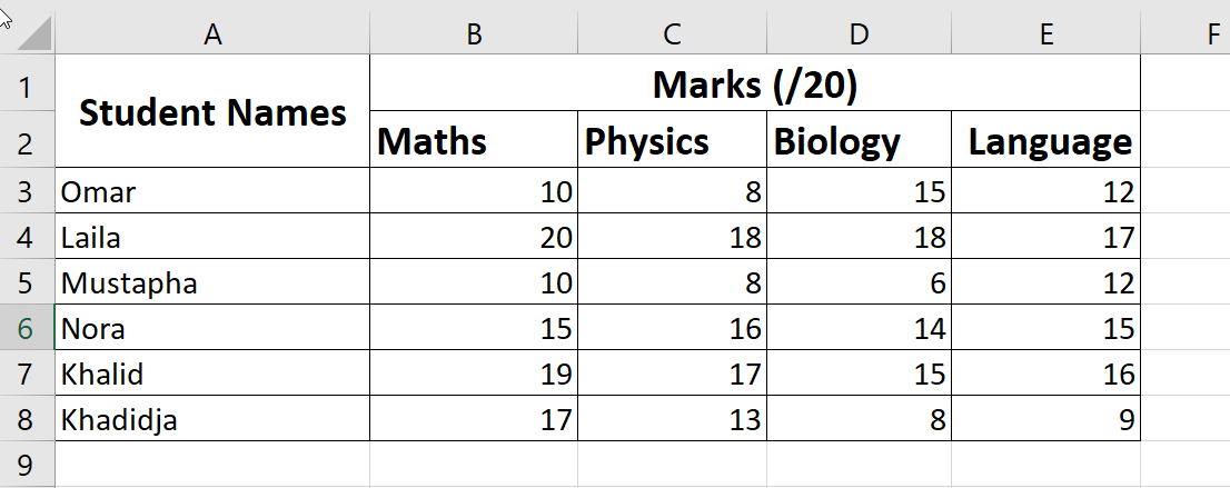 Figure 1: A table showing student marks.
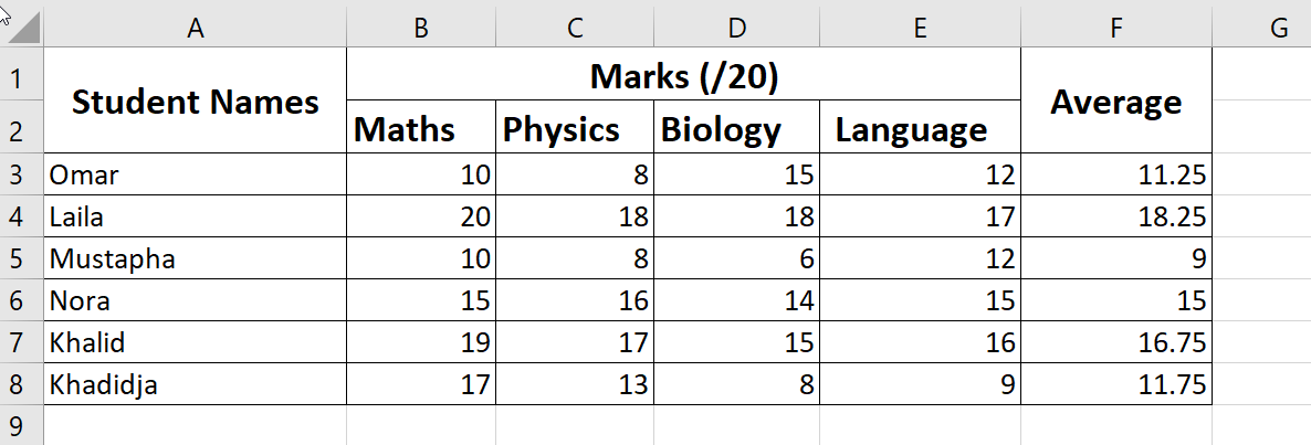 Figure 2: A table showing student marks and their averages.
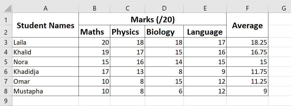 Figure 3: A table showing student marks and their averages sorted from highest to lowest.
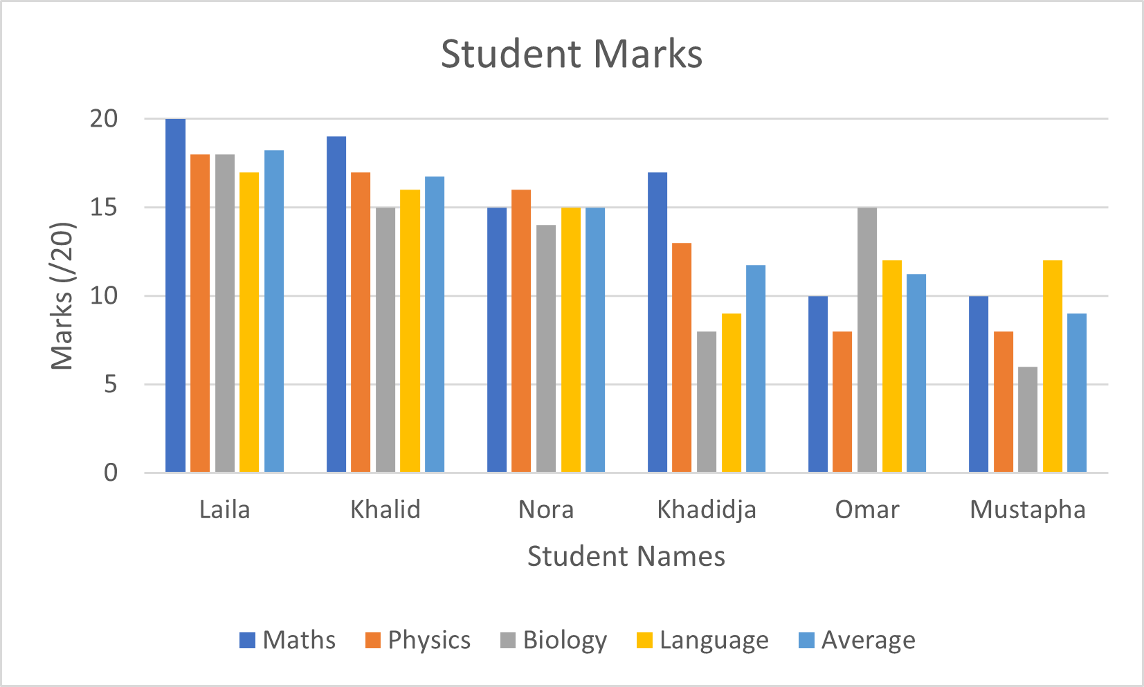 Figure 4: A clustered-column chart showing the data in the previous table(s).