1 Responsive Design
1.1 Exploration of Techniques
Responsive design is essential for Flutter applications to provide a consistent user experience across different screen sizes. This guide covers key techniques and widgets used in Flutter to create responsive layouts. We will mainly cover:
-
MediaQuery. -
FlexibleandExpandedWidgets. -
LayoutBuilder. -
OrientationBuilder. -
Responsive Packages (
flutter_screenutilandresponsive_framework).
1.1.1 Using MediaQuery
The MediaQuery widget provides information about the size, orientation, and pixel density of the device’s screen. This data can be used to dynamically adapt layouts.
import 'package:flutter/material.dart';

Widget build(BuildContext context) {
    var screenWidth = MediaQuery.of(context).size.width;

    return screenWidth > 600
        ? LargeScreenLayout()
        : SmallScreenLayout();
}
In this example, the layout switches between LargeScreenLayout and SmallScreenLayout based on the screen width.
1.1.2 Using Flexible and Expanded Widgets
The Flexible and Expanded widgets allow space allocation within a row or column, enabling components to resize relative to each other.
Row(
    children: [
        Expanded(child: Text("Left")),
        Expanded(child: Text("Center")),
        Expanded(child: Text("Right")),
    ],
)
Each text widget will take an equal amount of available space in this row, adapting to the screen width.
1.1.3 Using LayoutBuilder
LayoutBuilder helps create responsive UIs by giving access to the parent widget’s constraints.
LayoutBuilder(
    builder: (context, constraints) {
        if (constraints.maxWidth > 600) {
            return LargeScreenLayout();
        } else {
            return SmallScreenLayout();
        }
    }
)
This approach provides flexibility based on available width, making it easy to switch layouts or adjust content within a single widget.
1.1.4 Using OrientationBuilder
The OrientationBuilder widget detects the orientation of the device and adapts the layout accordingly.
OrientationBuilder(
builder: (context, orientation) {
return orientation == Orientation.portrait
? PortraitLayout()
: LandscapeLayout();
}
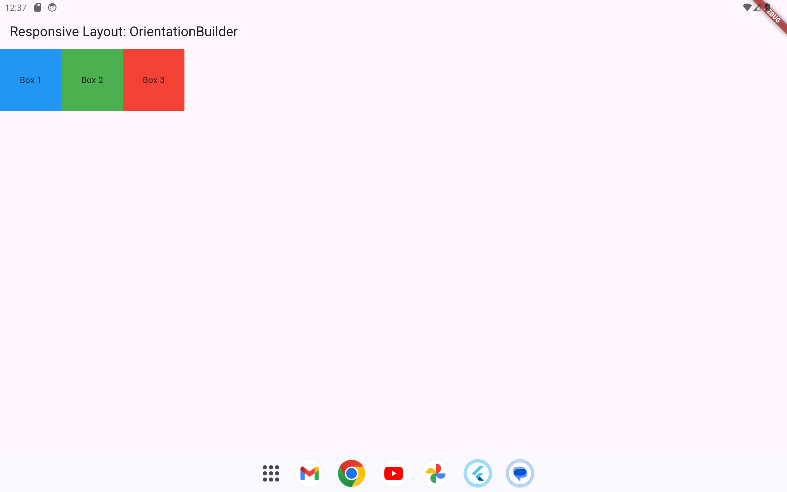
)By distinguishing between portrait and landscape modes, you can provide a customized experience depending on how the device is held.
1.1.5 Using Responsive Packages
Flutter also has packages such as responsive_framework that simplify creating adaptive layouts.
-
Install with:
flutter pub add responsive_framework -
Configure breakpoints to define layout behavior across different screen sizes.
Example:
ResponsiveWrapper.builder(
    child,
    breakpoints: [
        ResponsiveBreakpoint.resize(350, name: MOBILE),
        ResponsiveBreakpoint.autoScale(600, name: TABLET),
        ResponsiveBreakpoint.autoScale(800, name: DESKTOP),
    ],
);
With these breakpoints, the layout adjusts automatically based on predefined screen width ranges.
1.2 Example Application
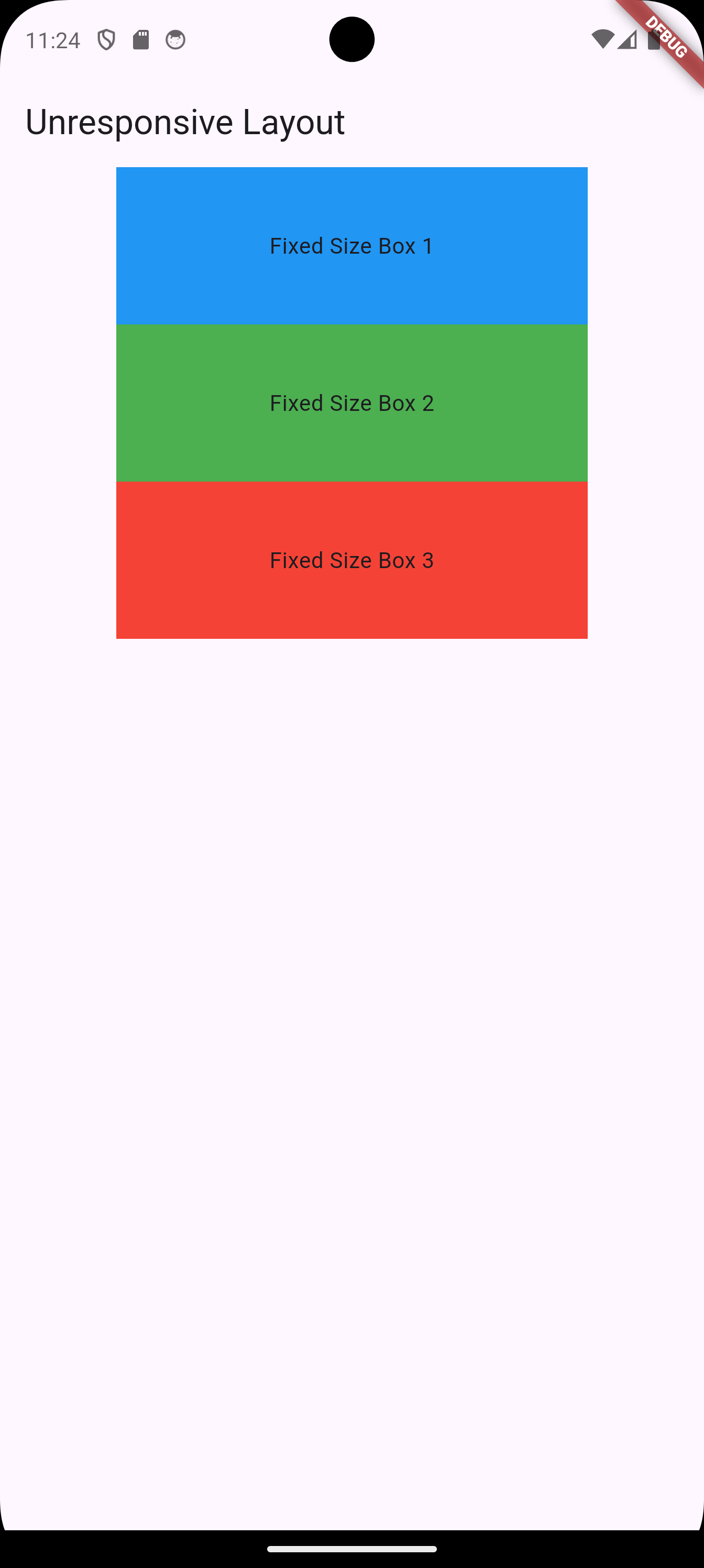
1.2.1 Unresponsive Flutter UI Example
The following Flutter code example is not designed with responsiveness in mind. Opening this app on devices with different screen sizes (such as phones and tablets) will likely result in poor layout and usability.
import 'package:flutter/material.dart';

void main() => runApp(MyApp());

class MyApp extends StatelessWidget {
  @override
  Widget build(BuildContext context) {
    return MaterialApp(
      home: Scaffold(
        appBar: AppBar(title: Text('Unresponsive Layout')),
        body: Center(
          child: Column(
            children: [
              Container(
                color: Colors.blue,
                width: 300,
                height: 100,
                child: Center(child: Text('Fixed Size Box 1')),
              ),
              Container(
                color: Colors.green,
                width: 300,
                height: 100,
                child: Center(child: Text('Fixed Size Box 2')),
              ),
              Container(
                color: Colors.red,
                width: 300,
                height: 100,
                child: Center(child: Text('Fixed Size Box 3')),
              ),
            ],
          ),
        ),
      ),
    );
  }
}
Explanation
-
Each
Containerwidget is given a fixed width and height of300pixels by100pixels. -
This setup does not adapt to screen size, which may result in parts of the layout being cut off on smaller screens, or overly spaced out on larger screens.
1.2.2 Improving the Layout with Responsive Design
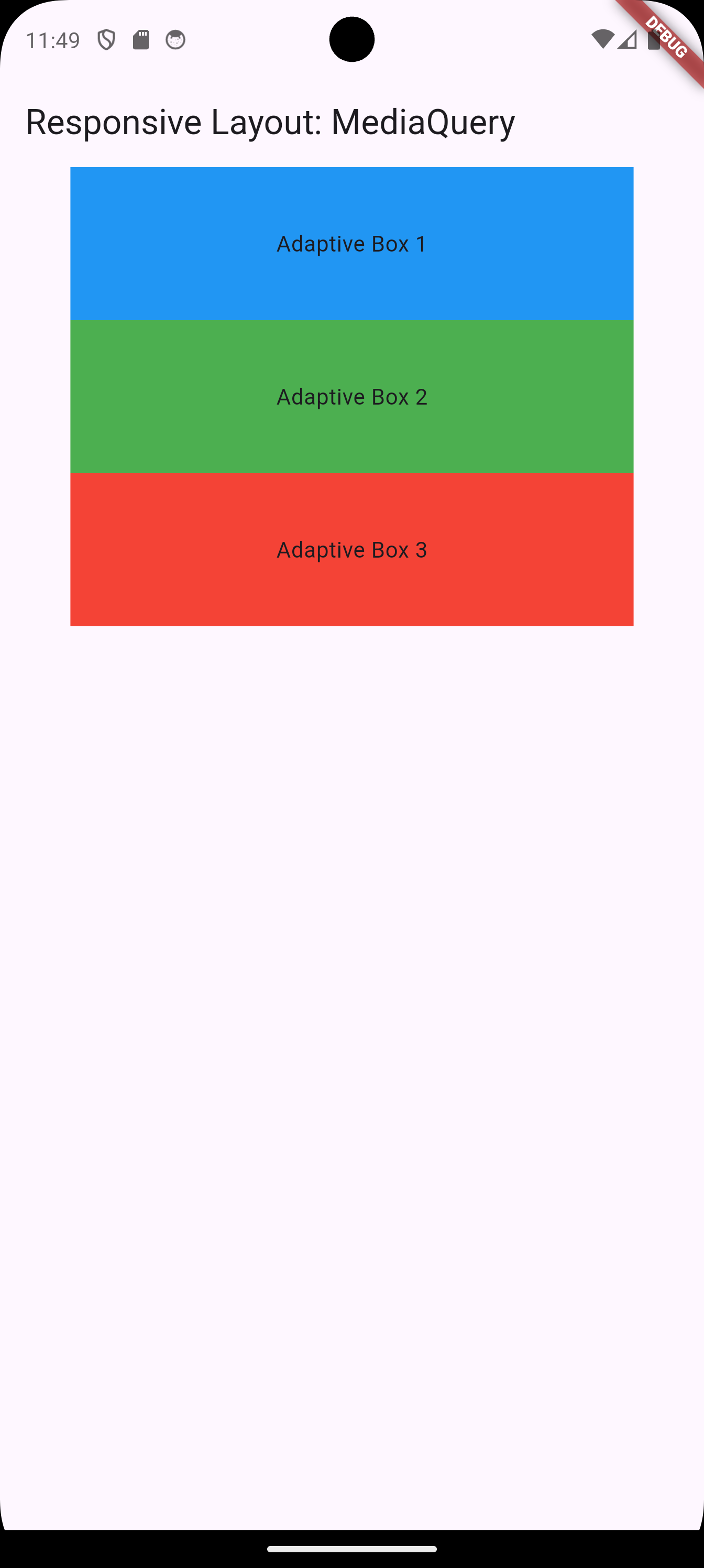
1.2.2.1 Using MediaQuery
MediaQuery allows the layout to adjust based on the device’s screen size.
import 'package:flutter/material.dart';

void main() => runApp(MyApp());

class MyApp extends StatelessWidget {
  @override
  Widget build(BuildContext context) {
    return MaterialApp(
      home: Scaffold(
        appBar: AppBar(title: Text('Responsive Layout: MediaQuery')),
        body: Center(
          child: Column(
            children: [
              Container(
                color: Colors.blue,
                width: MediaQuery.of(context).size.width * 0.8,
                height: MediaQuery.of(context).size.height * 0.1,
                child: Center(child: Text('Adaptive Box 1')),
              ),
              Container(
                color: Colors.green,
                width: MediaQuery.of(context).size.width * 0.8,
                height: MediaQuery.of(context).size.height * 0.1,
                child: Center(child: Text('Adaptive Box 2')),
              ),
              Container(
                color: Colors.red,
                width: MediaQuery.of(context).size.width * 0.8,
                height: MediaQuery.of(context).size.height * 0.1,
                child: Center(child: Text('Adaptive Box 3')),
              ),
            ],
          ),
        ),
      ),
    );
  }
}
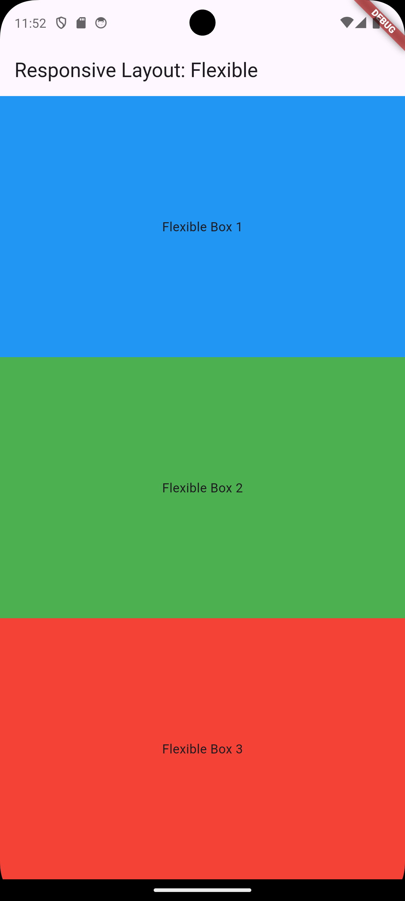
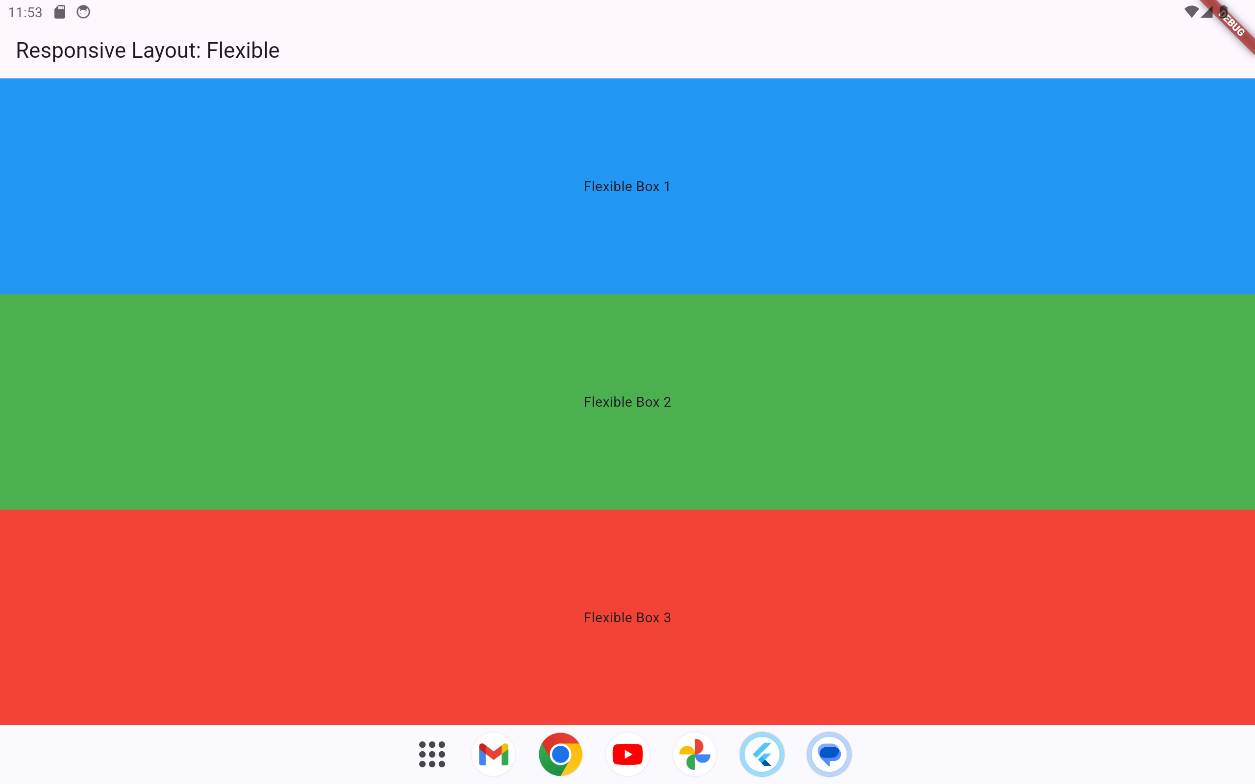
1.2.2.2 Using Flexible and Expanded
1.2.2.2.1 Example 1
Flexible and Expanded widgets ensure the layout dynamically allocates available space proportionally.
import 'package:flutter/material.dart';

void main() => runApp(MyApp());

class MyApp extends StatelessWidget {
  @override
  Widget build(BuildContext context) {
    return MaterialApp(
      home: Scaffold(
        appBar: AppBar(title: Text('Responsive Layout: Flexible')),
        body: Center(
          child: Column(
            children: [
              Flexible(
                child: Container(
                  color: Colors.blue,
                  child: Center(child: Text('Flexible Box 1')),
                ),
              ),
              Flexible(
                child: Container(
                  color: Colors.green,
                  child: Center(child: Text('Flexible Box 2')),
                ),
              ),
              Flexible(
                child: Container(
                  color: Colors.red,
                  child: Center(child: Text('Flexible Box 3')),
                ),
              ),
            ],
          ),
        ),
      ),
    );
  }
}
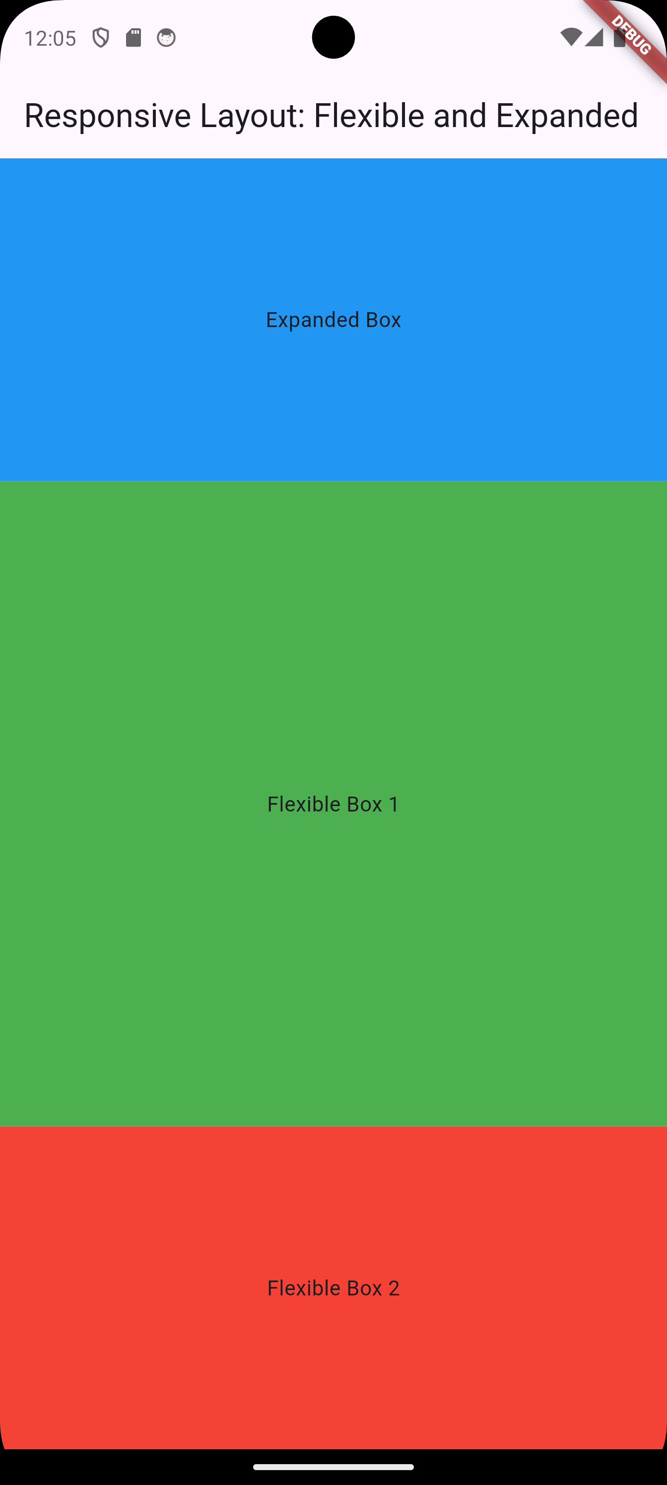
1.2.2.2.2 Example 2
The Flexible and Expanded widgets adjust the layout dynamically, but with slightly different behaviors:
-
Expandedforces the widget to take up all available space within its parent. -
Flexibleallows the widget to take as much space as it needs, while sharing available space with other siblingFlexiblewidgets proportionally.
import 'package:flutter/material.dart';

void main() => runApp(MyApp());

class MyApp extends StatelessWidget {
  @override
  Widget build(BuildContext context) {
    return MaterialApp(
      home: Scaffold(
        appBar: AppBar(title: Text('Responsive Layout: Flexible and Expanded')),
        body: Center(
          child: Column(
            children: [
              Expanded(
                child: Container(
                  color: Colors.blue,
                  child: Center(child: Text('Expanded Box')),
                ),
              ),
              Flexible(
                flex: 2, // Takes double the space of the next Flexible box
                child: Container(
                  color: Colors.green,
                  child: Center(child: Text('Flexible Box 1')),
                ),
              ),
              Flexible(
                flex: 1, // Takes half the space of the previous Flexible box
                child: Container(
                  color: Colors.red,
                  child: Center(child: Text('Flexible Box 2')),
                ),
              ),
            ],
          ),
        ),
      ),
    );
  }
}
Explanation
-
The
Expandedwidget ensures the blue box occupies all available vertical space, leaving the remaining space to be distributed between the green and red boxes. -
The two
Flexiblewidgets divide their space in a 2:1 ratio based on theirflexvalues.
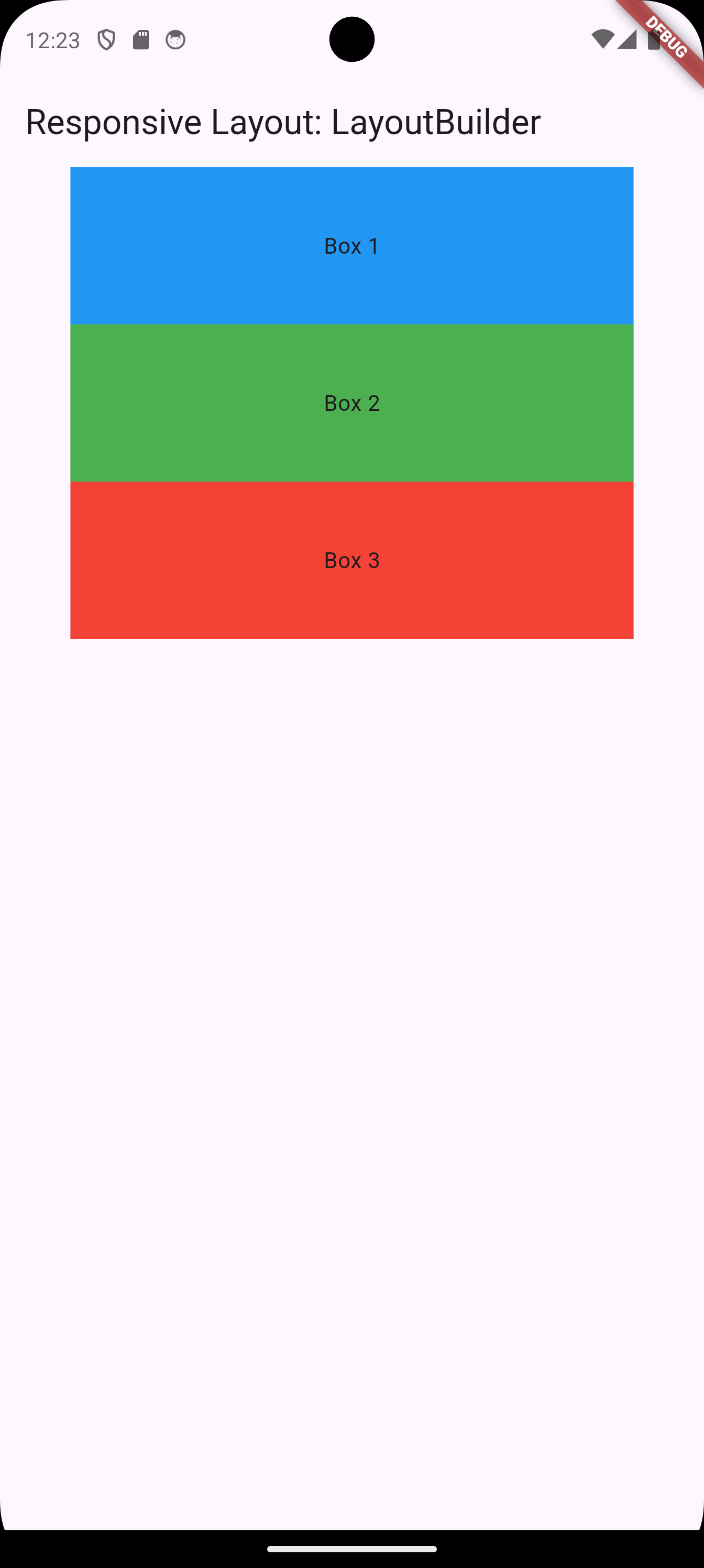
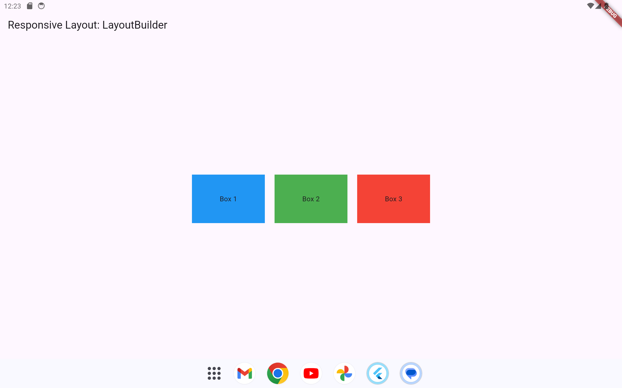
1.2.2.3 Using LayoutBuilder
LayoutBuilder adapts the layout by reacting to constraints, enabling different designs for different screen sizes.
import 'package:flutter/material.dart';

void main() => runApp(MyApp());

class MyApp extends StatelessWidget {
  @override
  Widget build(BuildContext context) {
    return MaterialApp(
      home: Scaffold(
        appBar: AppBar(title: Text('Responsive Layout: LayoutBuilder')),
        body: LayoutBuilder(
          builder: (context, constraints) {
            if (constraints.maxWidth > 600) {
              return Center(
                child: Row(
                  mainAxisAlignment: MainAxisAlignment.center,
                  children: [
                    Container(color: Colors.blue, width: 150, height: 100, child: Center(child: Text('Box 1'))),
                    SizedBox(width: 20),
                    Container(color: Colors.green, width: 150, height: 100, child: Center(child: Text('Box 2'))),
                    SizedBox(width: 20),
                    Container(color: Colors.red, width: 150, height: 100, child: Center(child: Text('Box 3'))),
                  ],
                ),
              );
            } else {
              return Center(
                child: Column(
                  children: [
                    Container(color: Colors.blue, width: constraints.maxWidth * 0.8, height: 100, child: Center(child: Text('Box 1'))),
                    Container(color: Colors.green, width: constraints.maxWidth * 0.8, height: 100, child: Center(child: Text('Box 2'))),
                    Container(color: Colors.red, width: constraints.maxWidth * 0.8, height: 100, child: Center(child: Text('Box 3'))),
                  ],
                ),
              );
            }
          },
        ),
      ),
    );
  }
}
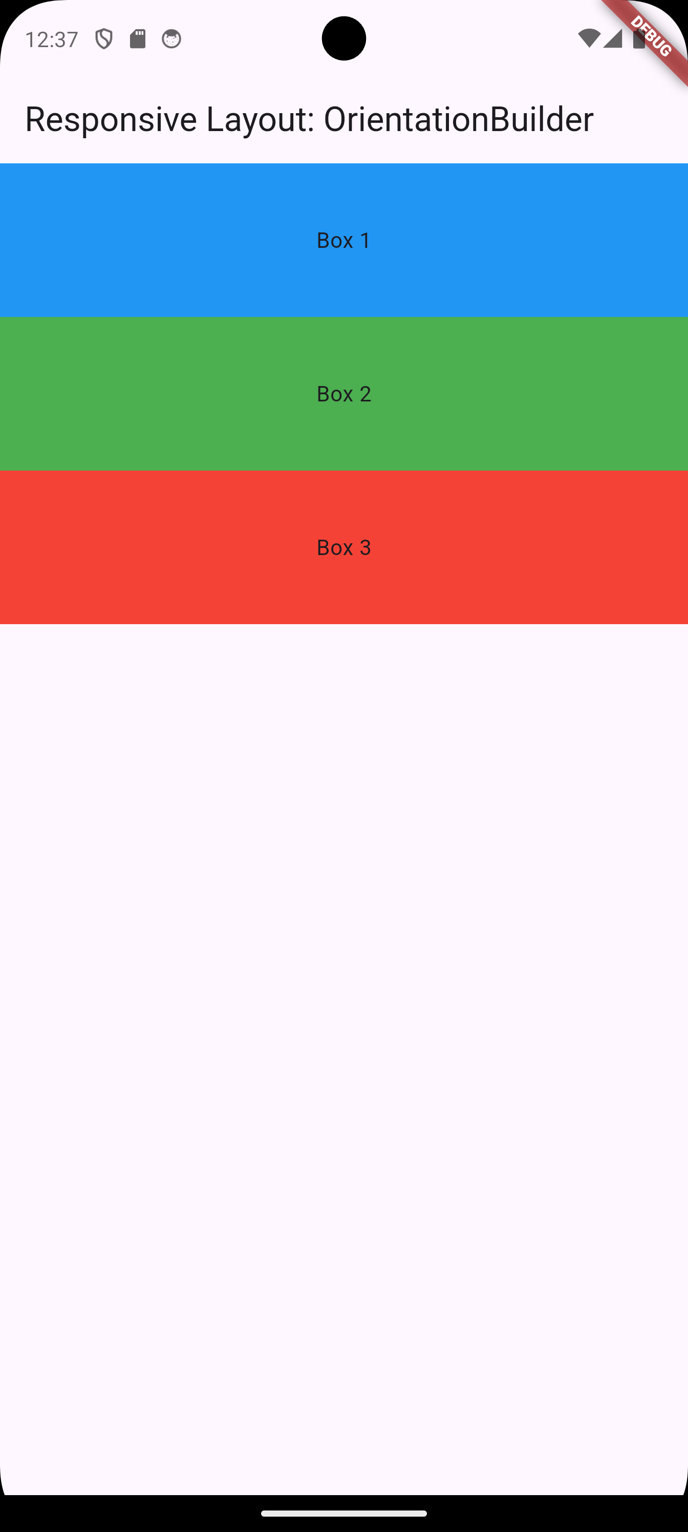
1.2.2.4 Using OrientationBuilder
OrientationBuilder adjusts the layout based on the device’s orientation.
import 'package:flutter/material.dart';

void main() => runApp(MyApp());

class MyApp extends StatelessWidget {
  @override
  Widget build(BuildContext context) {
    return MaterialApp(
      home: Scaffold(
        appBar: AppBar(title: Text('Responsive Layout: OrientationBuilder')),
        body: OrientationBuilder(
          builder: (context, orientation) {
            return orientation == Orientation.portrait
                ? Column(
                    children: [
                      Container(color: Colors.blue, height: 100, child: Center(child: Text('Box 1'))),
                      Container(color: Colors.green, height: 100, child: Center(child: Text('Box 2'))),
                      Container(color: Colors.red, height: 100, child: Center(child: Text('Box 3'))),
                    ],
                  )
                : Row(
                    children: [
                      Container(color: Colors.blue, width: 100, height: 100, child: Center(child: Text('Box 1'))),
                      Container(color: Colors.green, width: 100, height: 100, child: Center(child: Text('Box 2'))),
                      Container(color: Colors.red, width: 100, height: 100, child: Center(child: Text('Box 3'))),
                    ],
                  );
          },
        ),
      ),
    );
  }
}
1.2.2.5 Using Responsive Packages
1.2.2.5.1 Using Responsive Packages: flutter_screenutil
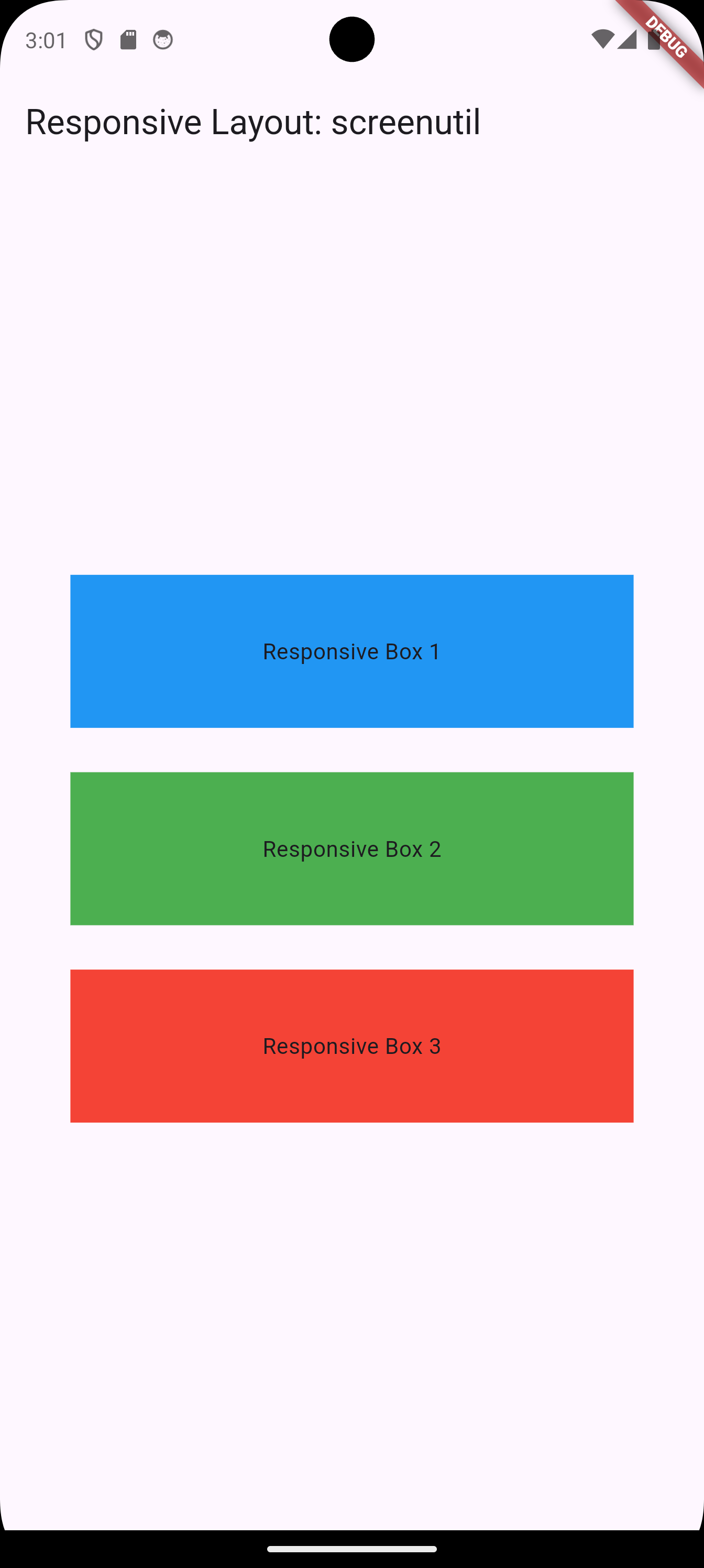
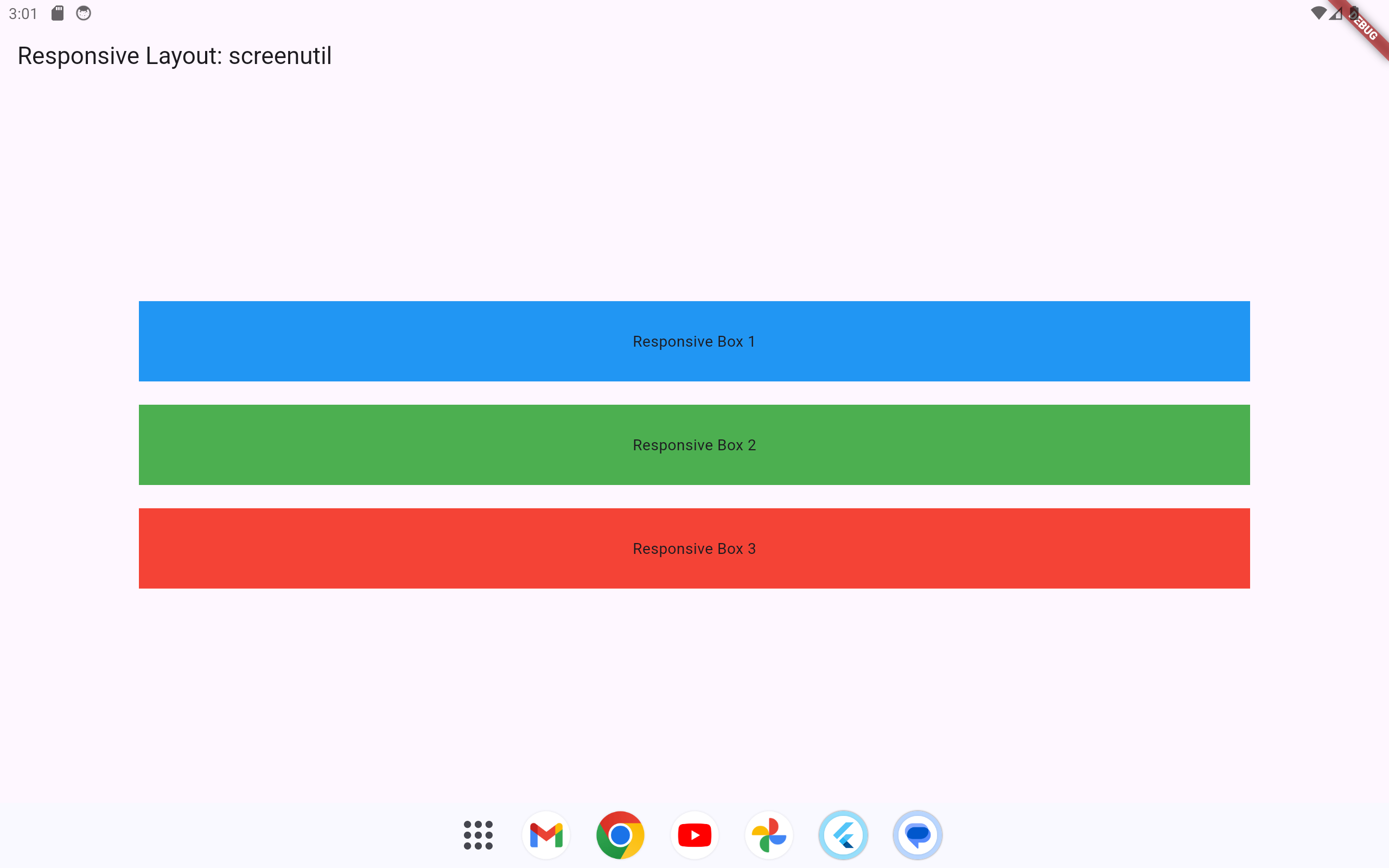
Using packages like flutter_screenutil allows us to set dimensions, font sizes, and other attributes relative to screen size. This approach ensures that our layout looks consistent across various screen sizes without manually adjusting dimensions.
-
First, add
flutter_screenutilto yourpubspec.yamlfile:dependencies: flutter: sdk: flutter flutter_screenutil: ^5.0.0 -
Run
flutter pub getto install the package.
Below is an example using flutter_screenutil to make the layout responsive:
import 'package:flutter/material.dart';
import 'package:flutter_screenutil/flutter_screenutil.dart';

void main() => runApp(MyApp());

class MyApp extends StatelessWidget {
  @override
  Widget build(BuildContext context) {
    return ScreenUtilInit(
      designSize: Size(360, 690), // Base design size
      minTextAdapt: true, // Adapt text size automatically
      builder: (context, child) => MaterialApp(
        home: ResponsiveScreen(),
      ),
    );
  }
}

class ResponsiveScreen extends StatelessWidget {
  @override
  Widget build(BuildContext context) {
    return Scaffold(
      appBar: AppBar(title: Text('Responsive Layout: screenutil')),
      body: Center(
        child: Column(
          mainAxisAlignment: MainAxisAlignment.center,
          children: [
            Container(
              color: Colors.blue,
              width: 0.8.sw, // Responsive width
              height: 0.1.sh, // Responsive height
              child: Center(child: Text('Responsive Box 1')),
            ),
            SizedBox(height: 20.h), // Responsive spacing
            Container(
              color: Colors.green,
              width: 0.8.sw,
              height: 0.1.sh,
              child: Center(child: Text('Responsive Box 2')),
            ),
            SizedBox(height: 20.h),
            Container(
              color: Colors.red,
              width: 0.8.sw,
              height: 0.1.sh,
              child: Center(child: Text('Responsive Box 3')),
            ),
          ],
        ),
      ),
    );
  }
}
Explanation
-
ScreenUtilInitinitializes theflutter_screenutilpackage with a design size (e.g., 360x690, typical for many devices). -
0.8.swand0.1.shadapt the width and height of the containers based on the screen width and height, respectively. -
SizedBox(height: 20.h)adapts the spacing between containers based on screen height.
1.2.2.5.2 Using Responsive Packages: responsive_framework
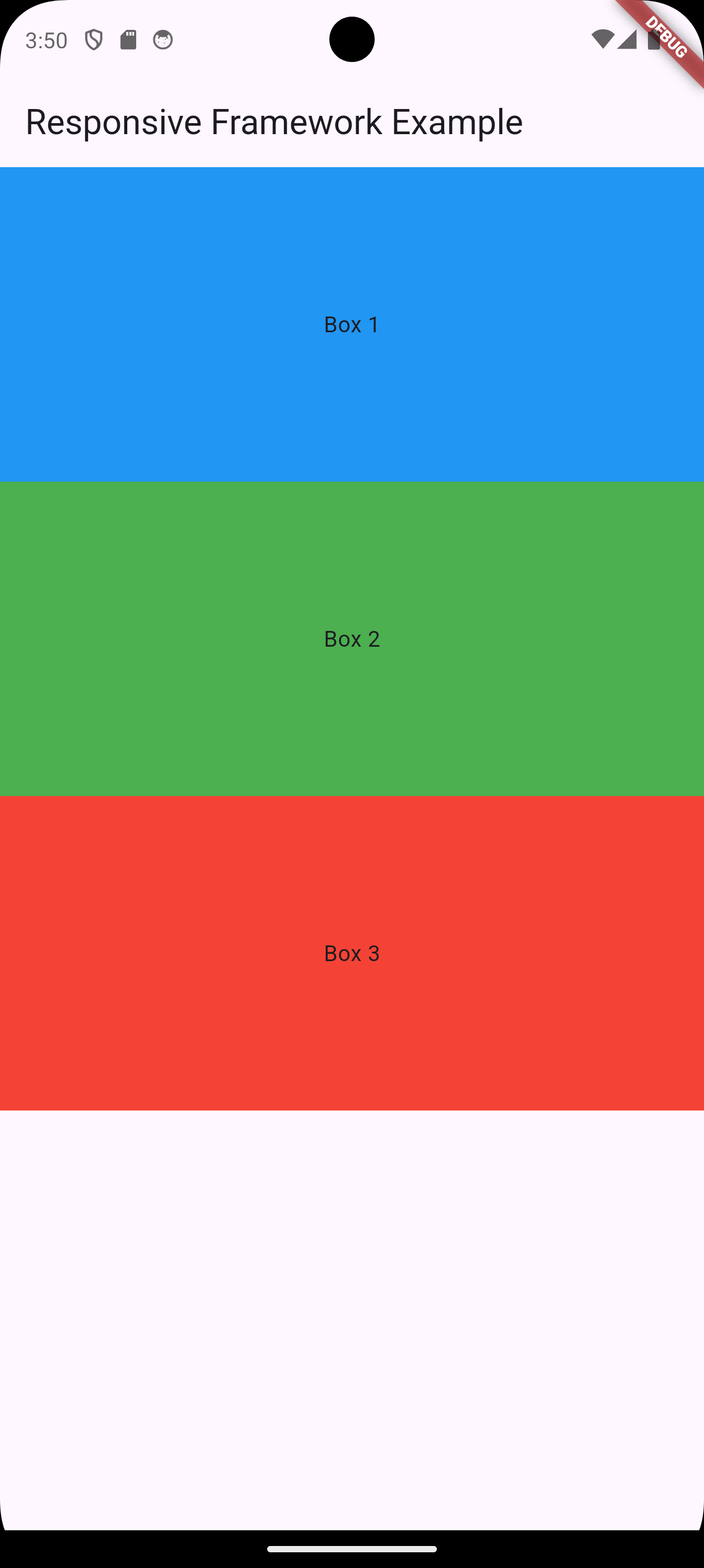
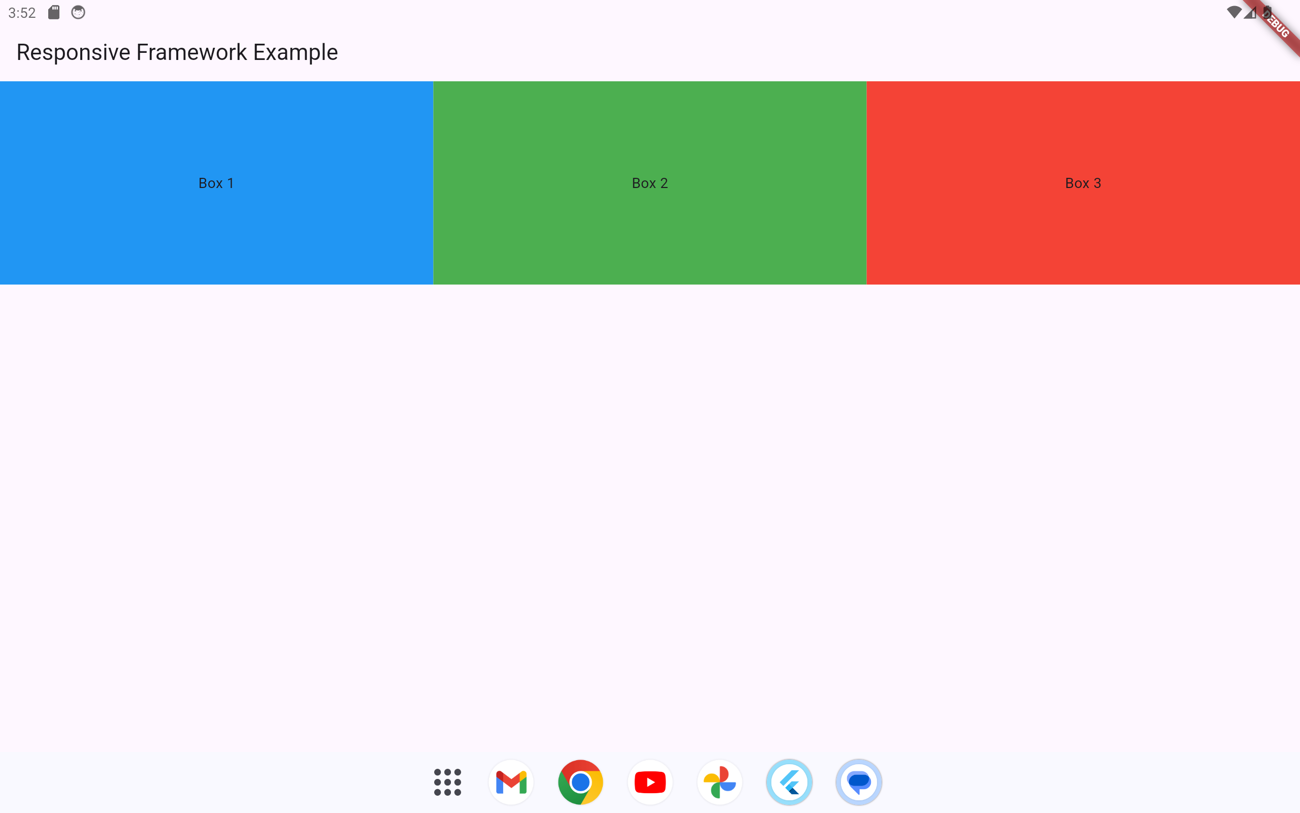
The responsive_framework package simplifies creating responsive layouts in Flutter by providing predefined breakpoints and tools to adjust UI elements dynamically based on the screen size and orientation. Below is an example of how to use responsive_framework to build a responsive layout.
-
First, add
responsive_frameworkto yourpubspec.yamlfile:dependencies: flutter: sdk: flutter responsive_framework: ^1.5.1 -
Run
flutter pub getto install the package.
import 'package:flutter/material.dart';
import 'package:responsive_framework/responsive_framework.dart';

void main() {
  runApp(const MyApp()); // Entry point of the application
}

class MyApp extends StatelessWidget {
  const MyApp({super.key});

  @override
  Widget build(BuildContext context) {
    return MaterialApp(
      // The `builder` property customizes how widgets are built in the app.
      builder: (context, child) {
        return ResponsiveBreakpoints.builder(
          // The child is the root widget of the app, passed through this builder.
          child: child!,
          // Define the breakpoints to determine device categories
          breakpoints: [
            const Breakpoint(
              start: 0,
              end: 450, // Devices with a width up to 450px are considered MOBILE
              name: MOBILE,
            ),
            const Breakpoint(
              start: 451,
              end: 800, // Devices between 451px and 800px are considered TABLET
              name: TABLET,
            ),
            const Breakpoint(
              start: 801,
              end: 1200, // Devices between 801px and 1200px are considered DESKTOP
              name: DESKTOP,
            ),
            const Breakpoint(
              start: 1201,
              end: double.infinity, // Devices wider than 1200px are categorized as XL
              name: 'XL',
            ),
          ],
        );
      },
      home: const ResponsiveScreen(), // Set the home screen of the app
    );
  }
}

class ResponsiveScreen extends StatelessWidget {
  const ResponsiveScreen({super.key});

  @override
  Widget build(BuildContext context) {
    return Scaffold(
      appBar: AppBar(
        title: const Text('Responsive Framework Example'), // AppBar title
      ),
      body: ResponsiveRowColumn(
        // Dynamically determine the layout based on the screen size
        layout: ResponsiveBreakpoints.of(context).isMobile
            ? ResponsiveRowColumnType.COLUMN // Use a column layout for smaller screens
            : ResponsiveRowColumnType.ROW,   // Use a row layout for larger screens
        children: [
          // First item in the layout
          ResponsiveRowColumnItem(
            rowFlex: 1, // If in a row, this item takes 1/3 of the row's width
            columnFlex: 1, // If in a column, this item takes equal height
            child: Container(
              color: Colors.blue, // Blue background for the first box
              height: 200, // Fixed height (applies in column layout)
              width: double.infinity, // Full width in column layout
              child: const Center(
                child: Text('Box 1'), // Centered text in the box
              ),
            ),
          ),
          // Second item in the layout
          ResponsiveRowColumnItem(
            rowFlex: 1, // If in a row, this item takes 1/3 of the row's width
            columnFlex: 1, // If in a column, this item takes equal height
            child: Container(
              color: Colors.green, // Green background for the second box
              height: 200, // Fixed height (applies in column layout)
              width: double.infinity, // Full width in column layout
              child: const Center(
                child: Text('Box 2'), // Centered text in the box
              ),
            ),
          ),
          // Third item in the layout
          ResponsiveRowColumnItem(
            rowFlex: 1, // If in a row, this item takes 1/3 of the row's width
            columnFlex: 1, // If in a column, this item takes equal height
            child: Container(
              color: Colors.red, // Red background for the third box
              height: 200, // Fixed height (applies in column layout)
              width: double.infinity, // Full width in column layout
              child: const Center(
                child: Text('Box 3'), // Centered text in the box
              ),
            ),
          ),
        ],
      ),
    );
  }
}
Explanation
-
Responsive Wrapper Initialization: The
ResponsiveWrapper.builderwraps theMaterialAppand defines global breakpoints:-
resize(450): For mobile screens, widgets resize to fit. -
autoScale(800): For tablets, widgets are scaled proportionally. -
autoScale(1200): For desktops, widgets are scaled proportionally.
-
-
ResponsiveRowColumn: Dynamically switches layout between a column for smaller screens and a row for larger screens.
-
ResponsiveRowColumnItem: Defines children for the
ResponsiveRowColumn, withrowFlexandcolumnFlexto control space distribution. -
Breakpoints Adaptation: The
layoutproperty switches betweenROWandCOLUMNbased on the current breakpoint.
Output
-
Mobile Layout: The boxes are stacked vertically in a column.
-
Tablet and Desktop Layout: The boxes are laid out horizontally in a row, with equal space distribution.
1.2.2.6 Summary
| Technique | Description |
|---|---|
| Technique | Description |
MediaQuery |
Provides information about the screen size, device pixel ratio, orientation, and other screen-related properties. It can be used to adjust the UI based on screen size. |
Flexible and Expanded Widgets |
Flexible allows a child widget to take up a proportional amount of space, and Expanded is a shortcut for Flexible with a factor of 1. Both widgets help create flexible layouts within Row and Column. |
LayoutBuilder |
A widget that builds a widget tree based on the parent’s constraints. It’s useful when you need to create dynamic layouts depending on the available space. |
OrientationBuilder |
A widget that allows you to build a widget tree based on the device’s orientation (portrait or landscape). It is useful for adjusting the layout based on orientation. |
Responsive Packages (flutter_screenutil, responsive_framework) |
Packages like flutter_screenutil and responsive_framework help manage responsiveness by defining breakpoints and adjusting widget properties like size, padding, and font size according to screen size or device type. |
1.3 Further Techniques
Additionally, here are other ways to enforce responsiveness:
-
AspectRatioWidget: Ensures that the width and height of a widget are kept in a fixed ratio. This is useful for maintaining consistent aspect ratios across different screen sizes. -
FractionallySizedBox: A widget that sizes its child based on a fraction of the available space. It’s useful for proportionally sizing elements in a responsive layout. -
SliverGridandSliverList: Part of theCustomScrollView, these widgets are useful for creating grid and list layouts that adapt responsively to screen size and available space. -
Custom Breakpoints: You can create your own breakpoints manually and use them to adjust widget behavior based on the width of the screen. You can combine this with
MediaQueryorLayoutBuilderto create custom, fine-tuned responsive layouts. -
IntrinsicWidthandIntrinsicHeightWidgets: These widgets allow you to size a widget based on its child’s intrinsic size. They can help maintain a consistent size for elements without worrying about overflow. -
SizedBoxandSpacer: These widgets can be used to add spacing in a responsive way by adjusting their size based on screen constraints or layout conditions. -
WrapWidget: TheWrapwidget automatically wraps its children to a new line when there’s not enough horizontal space. It’s a good option for responsive layouts when the number of children is dynamic. -
CustomMultiChildLayout: For advanced layouts, you can use theCustomMultiChildLayoutwidget to define a custom layout for its children, which can adapt to screen size and orientation dynamically. -
TextScaleFactorwithMediaQuery: You can customize the text size based on the screen size using thetextScaleFactorparameter fromMediaQuery. This can help ensure that text sizes remain legible across different screen sizes. -
CustomPainterandCanvas: For highly custom layouts, you can useCustomPainterto draw directly onto the screen and calculate the layout based on the device’s screen size. -
Flutter’s Responsive Design Library:
flutter_responsive: An alternative to the libraries you mentioned,flutter_responsiveis another responsive design library that uses the screen’s width and height to adjust widgets dynamically.